
CASE STUDY
Building a fleet system designed for visibility and control
A 6-month platform build that unified booking, fleet, drivers, and finance.
Then a post-delivery discovery that led to a deeper operational problem and a purpose-built predictive system to solve it.
SCOPE
0 -> 1
TEAM
2 Designers
Platform
Web and Mobile WPA
TIMELINE
8 Weeks
00
Executive
summary
The brief
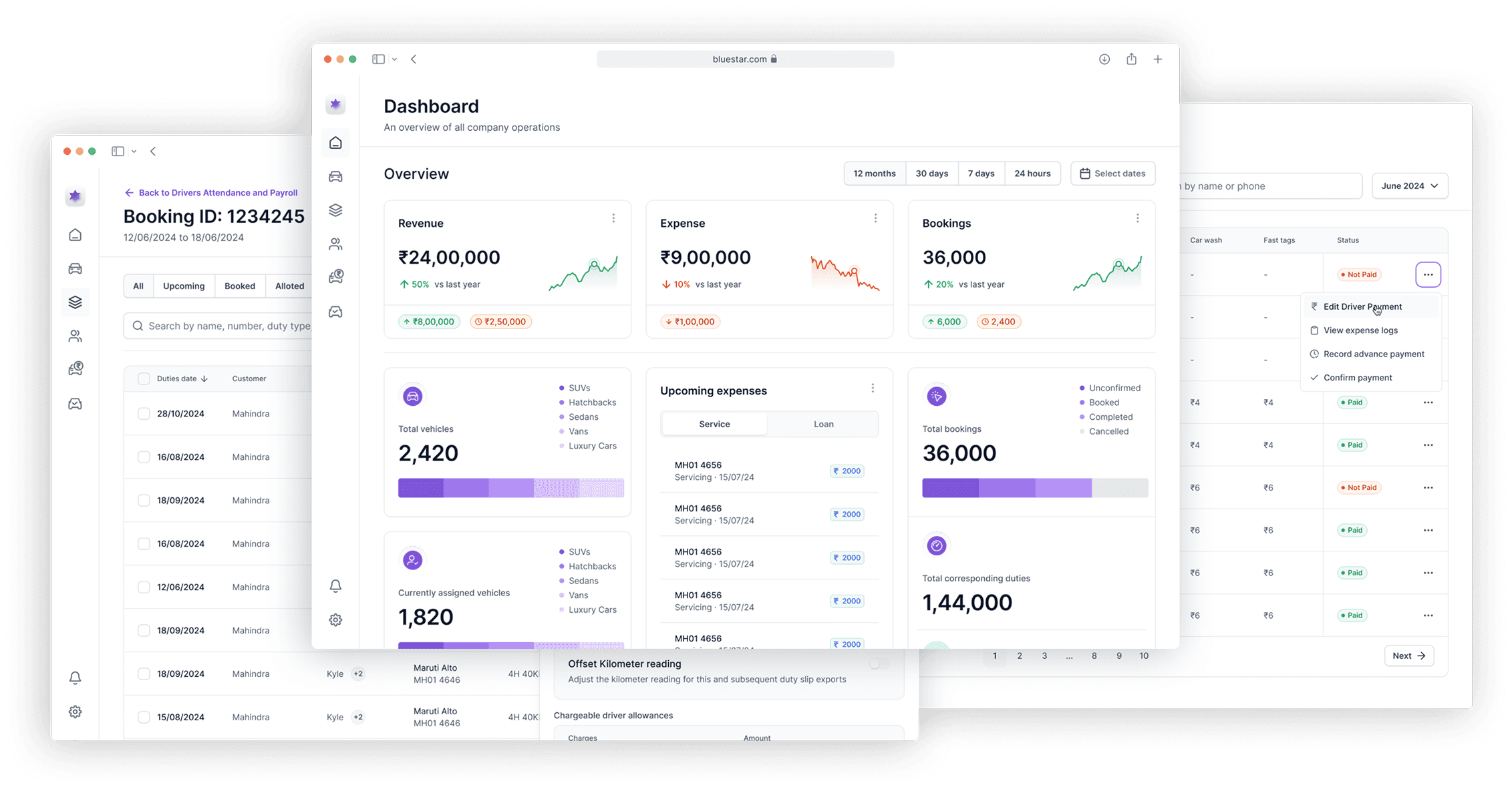
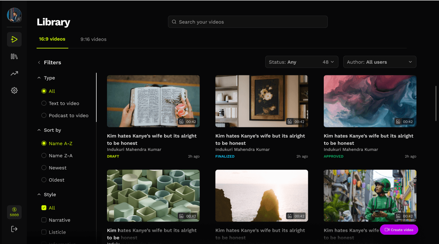
Bluestar's fleet operations ran across five separate tools: one for bookings, one for driver records, spreadsheets for finance, a separate system for vehicle tracking, and WhatsApp for coordination. Nothing talked to anything else. Every task required manual reconciliation across platforms.
WHAT WE DID
We designed and built a unified platform: five modules connected to a single database. Post-launch, we ran structured feedback sessions with operators and uncovered a problem the new platform had not solved: cascading trip delays. We designed a predictive intervention system on top of the platform to address it.
IMPACT
Eliminated manual coordination, reducing month-end reconciliation from days to hours. By tackling cascading delays, improvement in operational visibility shifted operators from reactive firefighting to proactive intervention. The broader business metric story is detailed in the Impact section.
BEFORE WE BEGIN
Supabase
BACKEND
Figma MCP
DESIGN
Claude Code
AGENTIC AI
Cursor
IDE
Vercel
SERVER

My favorite part of this process was stepping into technical territories I hadn’t explored before. Using AI as a collaborator, I built segments of this system end-to-end, which fundamentally changed my design philosophy.
It’s an exciting time to be a designer.
We are no longer limited to shaping interfaces and experiences; we are now actively shaping systems, logic, and ultimate outcomes.
01
Introduction
Bluestar is a B2B fleet management company operating across multiple Indian cities. They provide contracted vehicle and driver services to corporate clients: employee transportation, logistics runs, and executive travel. Clients pay per trip; Bluestar manages the fleet, the drivers, the scheduling, and the billing on their behalf.
SCALE
1800+
Active vehicles
Across sedan, SUV, and luxury categories
4
CITIES
Operations running in 4 cities at project start
B2B
Revenue model
Per-trip billing to corporate accounts
02
Users and business
Three users interact with the system. Our focus was the operator: the person whose efficiency the platform was built to improve.
PRIMARY PERSONA
Operators (Admins)
Responsible for creating booking, assigning and dispatching vehicle and generating duty invoice
~200
Vehicles per operator
~80%
Operations were manual
~35%
Effort on reconciliation
PAIN POINTS IN CURRENT WORKFLOW
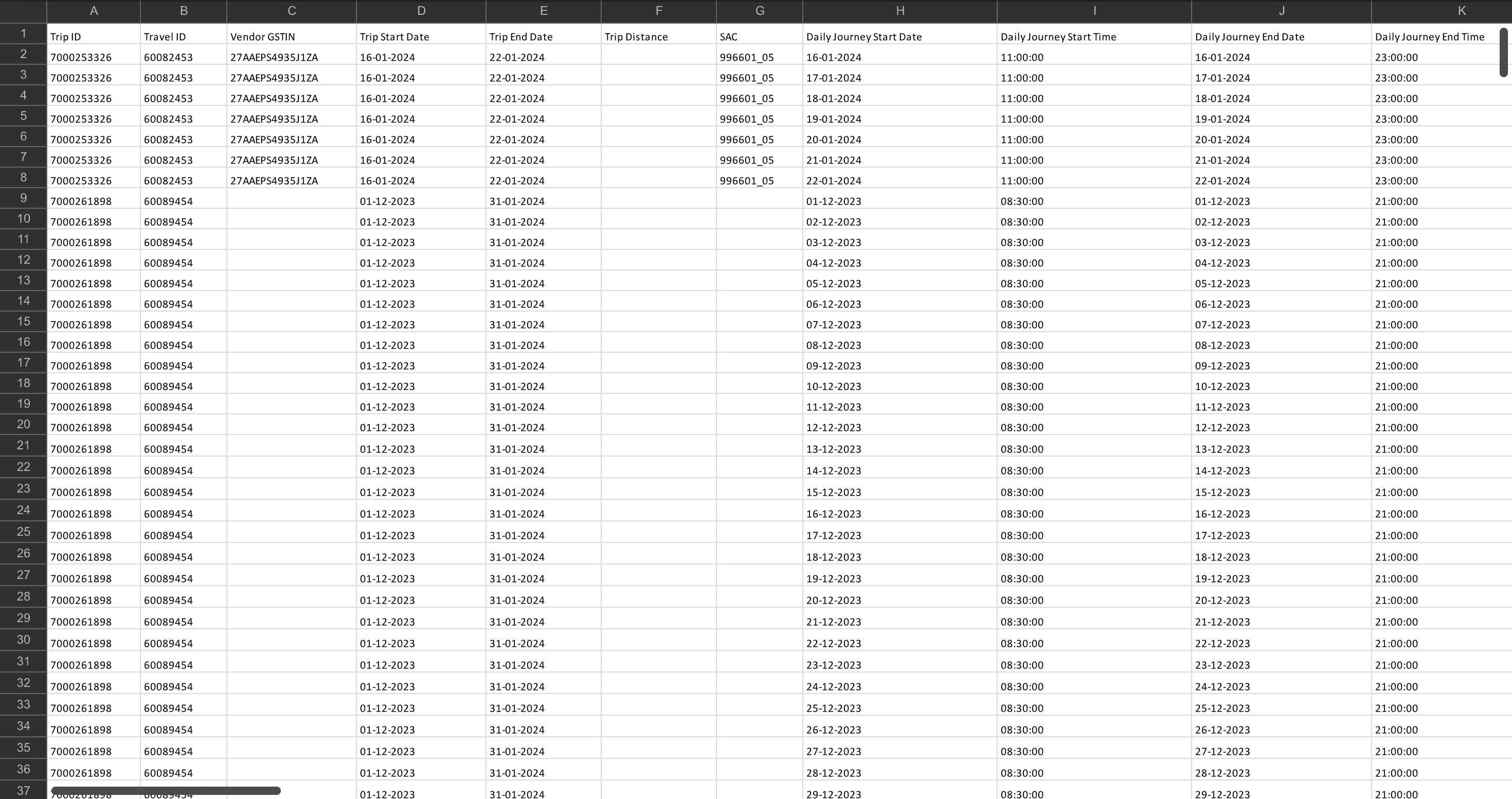
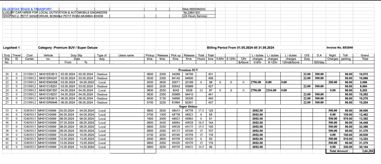
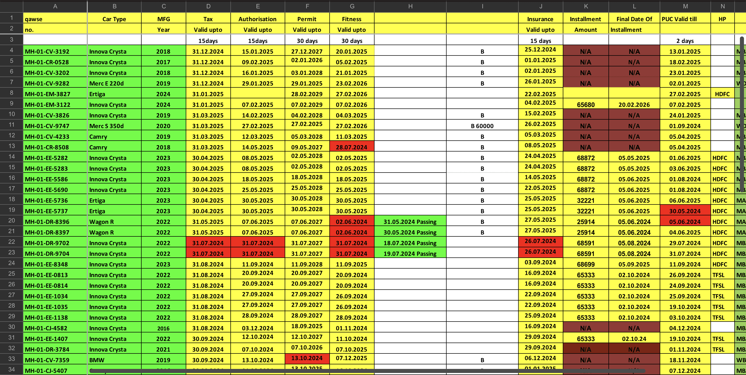
Booking confirmations spread across 5 separate tools with no single view.
Vehicle availability checked by phone call, not live data.
Driver assignment sent over WhatsApp with no audit trail or confirmation loop.
No visibility into a duty once it was in progress until the driver manually marked it complete.
MULTIPLE
SPREADSHEET
SECONDARY PERSONA
Drivers
Assigned to duties by operators. Receive trip details and completes the duty.
Passengers
They book Bluestar's transport services via their company and have no direct access to the platform.
BUSINESS IMPACT
Revenue leakage
Billing errors and missed invoice generation meant trips occasionally went unbilled or were invoiced late, delaying cash flow.
Asset underutilisation
Double-booking led to last-minute cancellations and idle vehicles. No live availability meant planners couldn't optimise allocation.
Staff overhead
Fleet managers and finance staff spent significant time on coordination and reconciliation that produced no new value.
02
Unifying the experience
Both designers wrote production code. The design was not handed off. It was shipped.
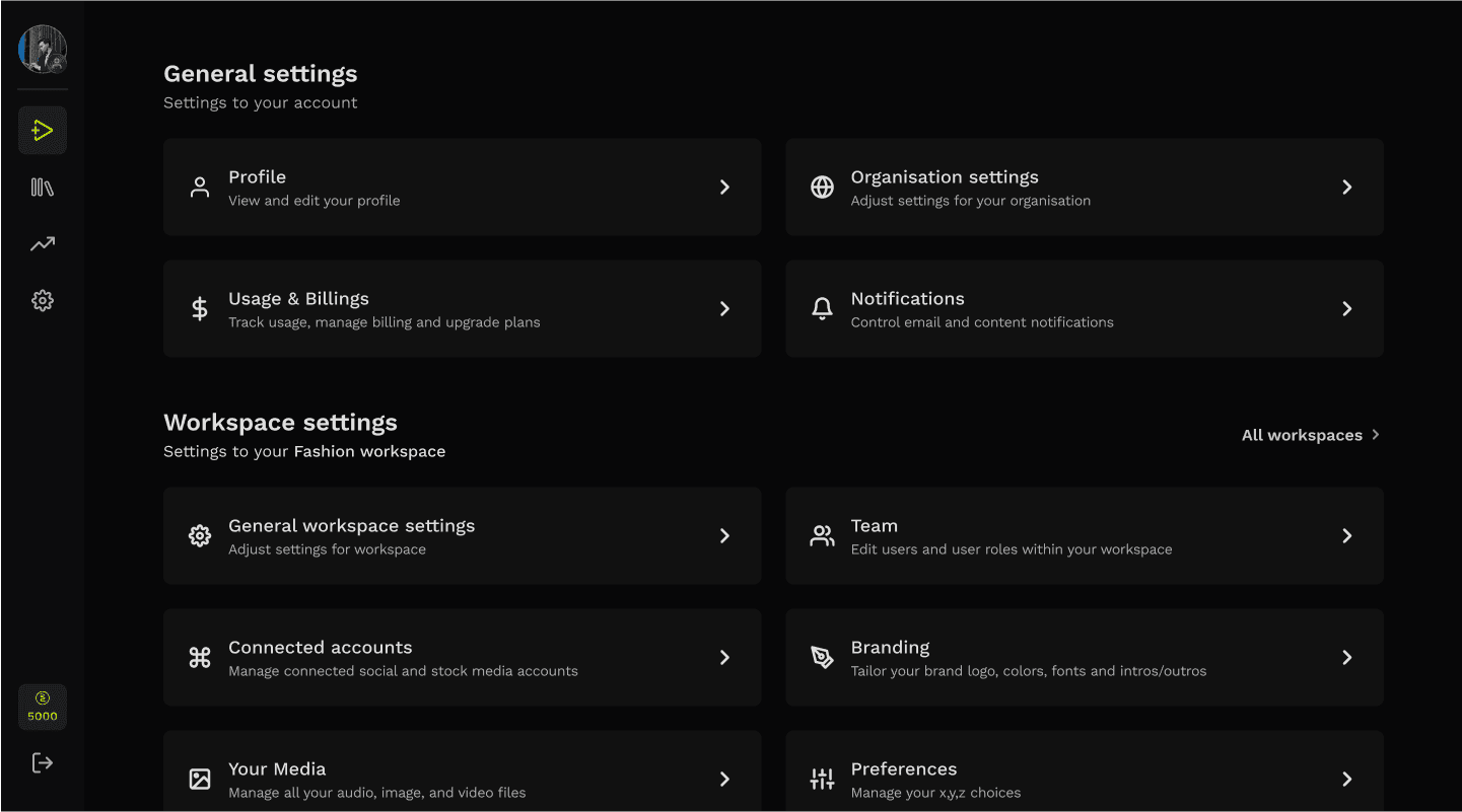
LAYING THE Platform architecture
DEFRAMENTING
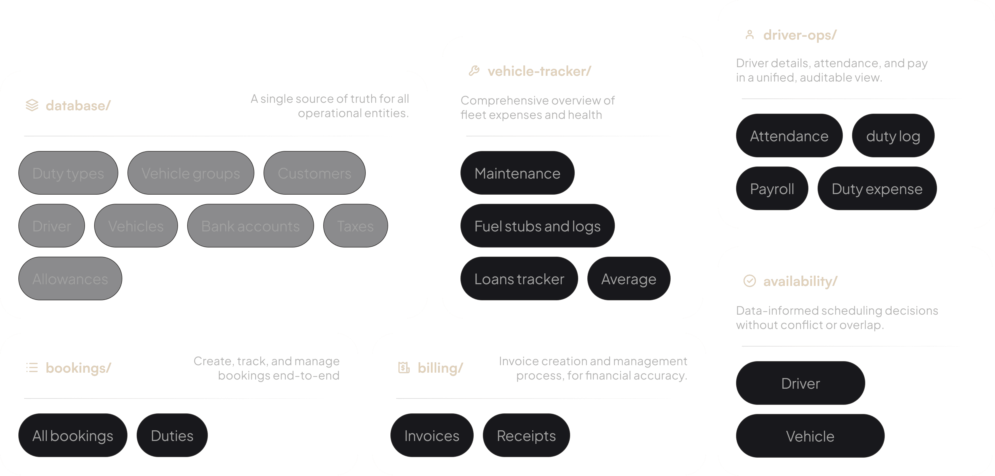
So I spent time breaking down all the information they dealt with…
and started grouping it into mental models that actually made sense to them.
MODULES
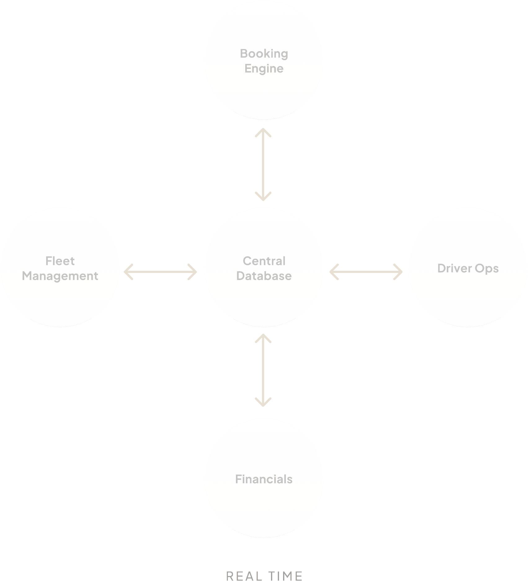
SINGLE SOURCE OF TRUTH
Five modules. One central database. Every module reads from and writes to the same source of truth, with no syncing, no reconciliation, and no data living in two places.

04
Post-delivery findings
After launch, we ran structured interviews with fleet operators using the new system.
02
Building for trust and reliability
Both designers wrote production code. The design was not handed off. It was shipped.
CREATION USER FLOW
NEXT DUTY
CURRENT DUTY
CURRENT DUTY
6:00 PM
6:08 PM
BUFFER
45 MINS
7:00 PM
7:30 PM
6:30 PM
7:45 PM
7:45 PM
DRIVER A
DRIVER B
COULD COVER DRIVER A’s DUTY
delay for expected reasons (such as traffic)
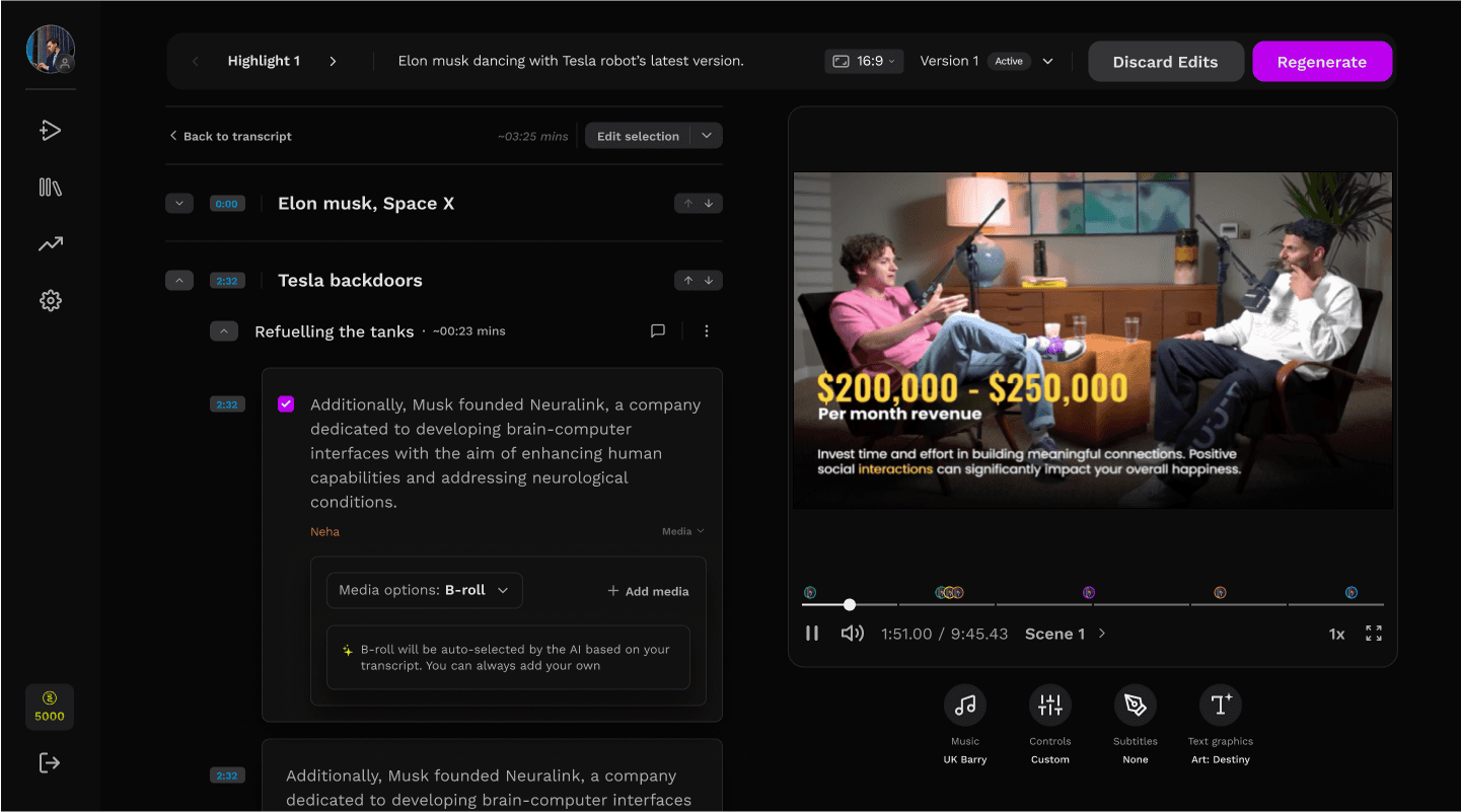
REVIEW, EDIT AND REGENERATE
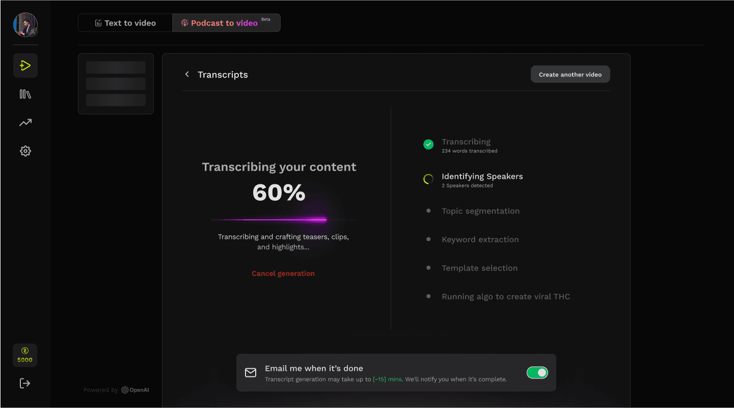
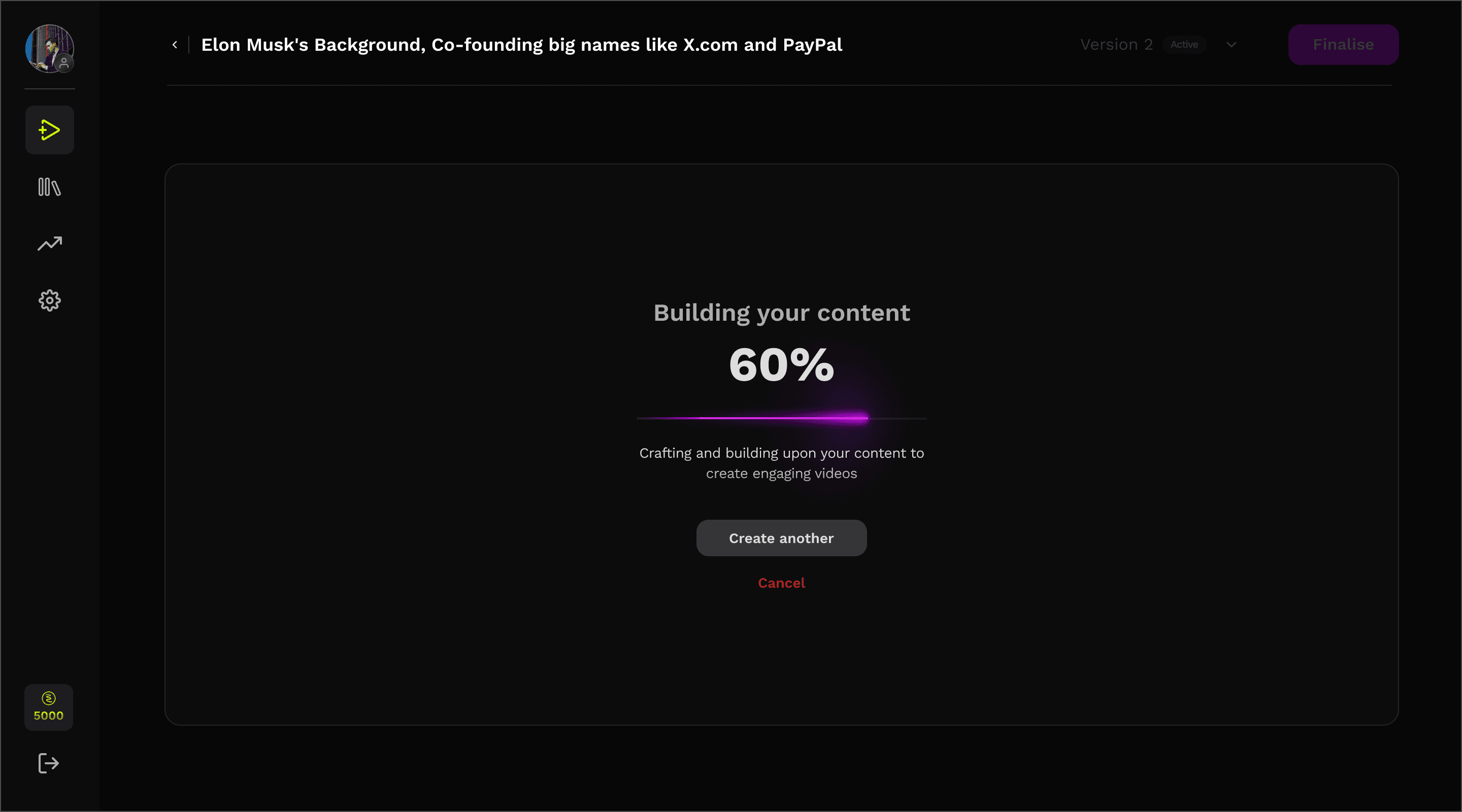
A major chunk of our user abandoned the video creation process during the review and edit process
RESEARCH
ONLINE RESEARCH
Conducted surveys with 50+ content creators.


IN-DEPTH INTERVIEW
Led 12 one-on-one interview sessions.

COMPETITOR ANALYSIS
Evaluated 4 leading content creation tools.



USER TESTING
Observed 10+ users to observe the pain points.

USER FINDINGS
Information felt incoherent and unstructured.
Users could not map script → video output
Editing required mental translation
Limited set of editing controls
LEADING TO
Enormous time to value
{
mins
8
Video Generation
+
mins
12
Video Generation
}
+
2.5
Average Regeneration
=
mins
50
Avg. time spent
50 MINS AVG, - TIME TO VALUE
SETTING PRIORITIES
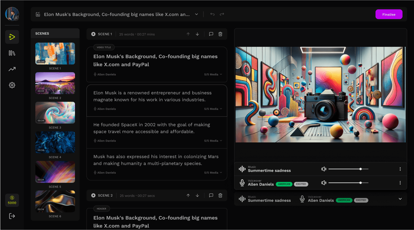
REVIEW AND EDIT SCREEN
Reduce dependency on regeneration by improving edit-ability
Introduce structure during edits.
Align script with the video timeline.
Allow more precise editing decisions without adding complexity
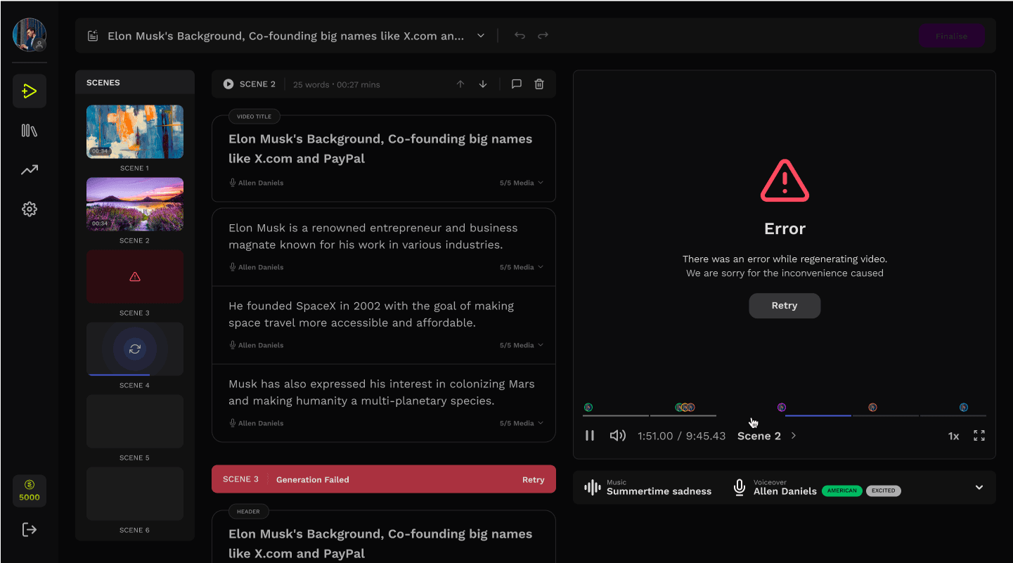
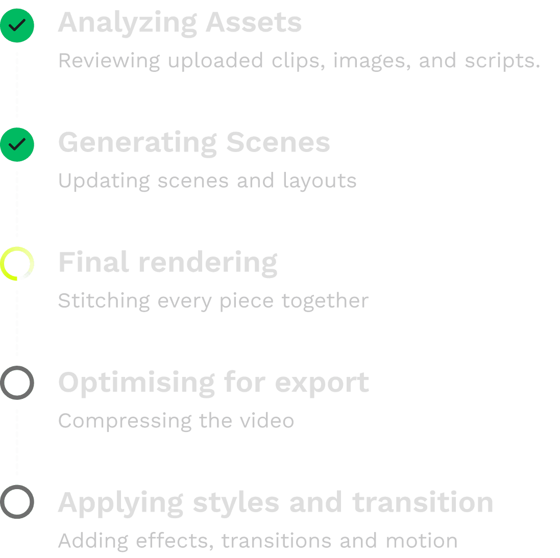
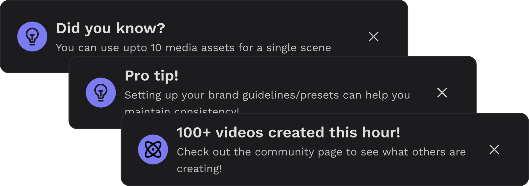
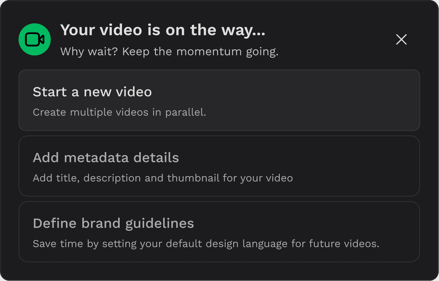
REGENERATING SCREEN
Engaging user during generation
Introduce ways to engage users during the idle regeneration process
03
Designs and discussions
Diverged into several possible interaction models, wireframing different layout structures abd understanding the system
1
ReVIEW AND EDIT SCREEN
At that moment the tech limitations could not simply fasten the process of regeneration.
MID-FI LAYOUTS TO GET VALIDATIONS
Timeline-first
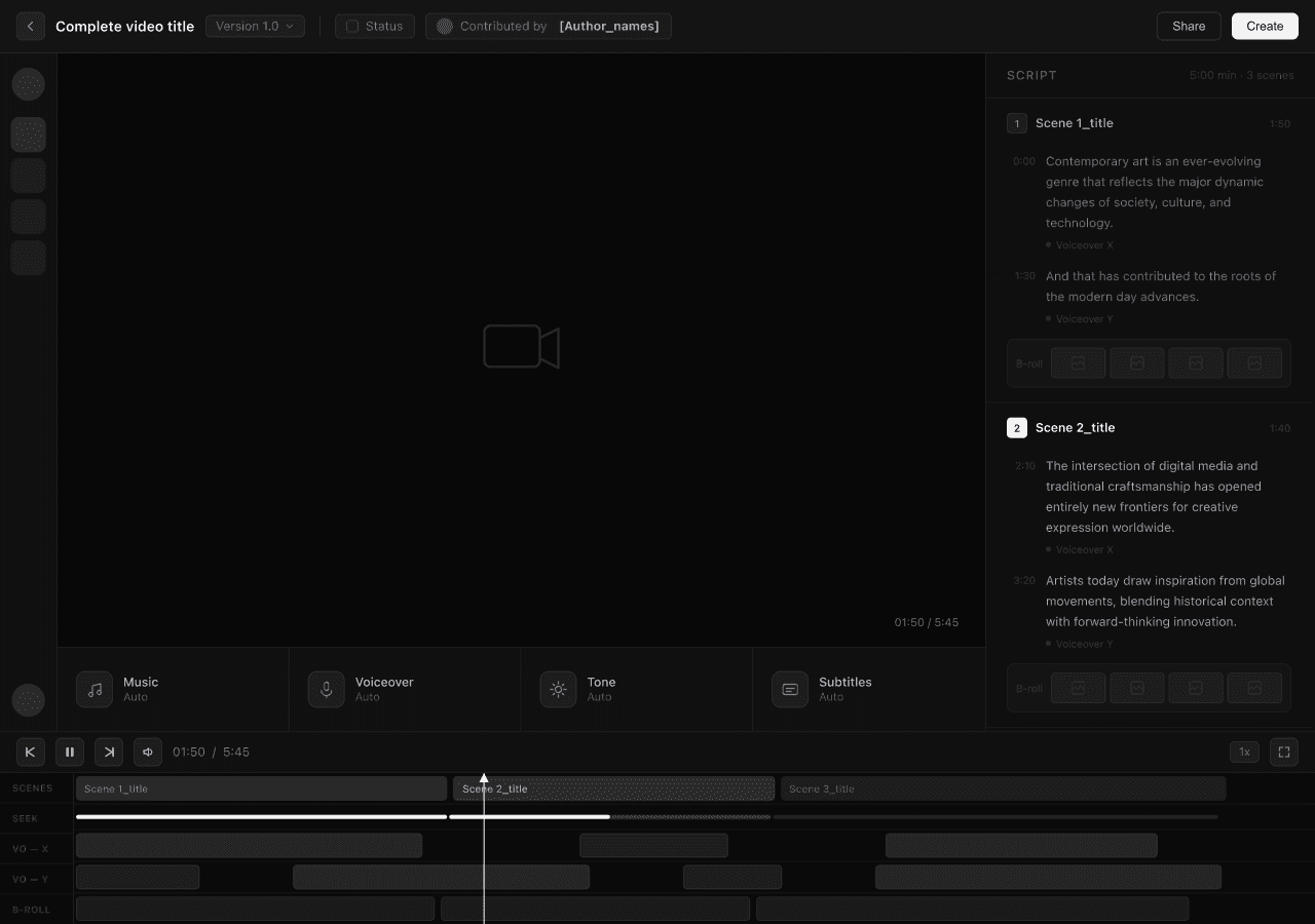
HYPOTHESIS
Timeline interface improves editing precision
TRADE oFF
Too complicated and technical for target users, has a higher learning curve

Scene-first
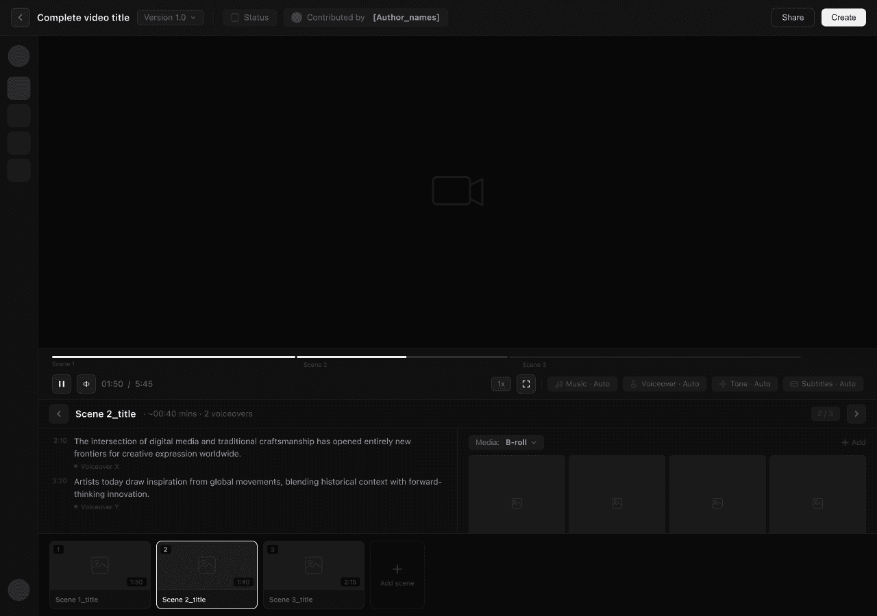
HYPOTHESIS
Great for focused editing
TRADE oFF
Scene took precedence over script and hindering visibility of the overall video structure
Script-first
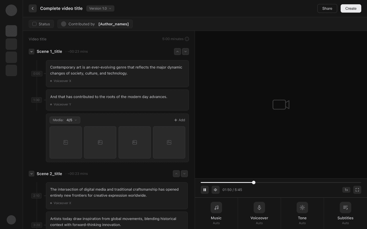
HYPOTHESIS
User thinks in narrative. Not timeline.
WHY BETTER?
Extremely easy mental model. mostly like editing a document and this structure felt scalable even with longer videos having multiple scenes.


2
GENERATING SCREEN
We initially investigated optimizing the backend video creation pipeline to facilitate faster generations. However, engineering confirmed that significant speed improvement in generation were unlikely in the short term.
COLLABORATING WITH TECH
Other technical considerations to reduce the time that looked promising, but didn't work.

Lowering video quality during edits. Hurts editing experience.
While this could have accelerated regeneration, it would have compromised the user experience during the critical editing phase.

Limit high-latency editing options. Reduced flexibility users wanted.
While this could have improved rendering speed, it would have reduced flexibility and personalization — directly conflicting with user needs.

Making dynamic video edits. Too expensive at the time.
Allowing users to edit directly on the video. While promising, the engineering investment was too high relative to the projected impact.
EXPLORING ENGAGEMENT EXPERIENCES
04
Insights during validating
Testing it with the user for validating the designs led to an important pivot in
the design approach.
Scene BASED VIDEO
SCENE 1
SCENE 2
SCENE 3
<- EDIT HERE
OBSERVATION
With scenes, users were making fewer edits overall, only to a few certain scenes.
USER INTERFACE
s1
s2
s3
s4
BACKEND
V1
constraint
Despite a scene-based interface, the backend rendered the video as a single unit, causing even small edits to trigger full video regeneration.
USER INTERFACE
s1
s2
s3
s4
BACKEND
s1
s2
s3
s4
QUESTION
What if we treated a video as a collection of independent scenes?
breakthrough
If scenes could be regenerated independently, users would only need to regenerate the part they edited.
This idea led to scene-based architecture and a shift in the product roadmap.
SCENE 1
SCENE 2
SCENE 3
SCENE 4
<- REGENERATE
HERE

05
Final Designs
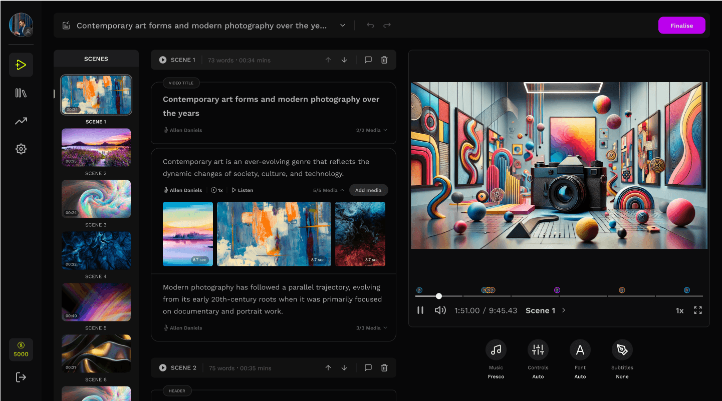
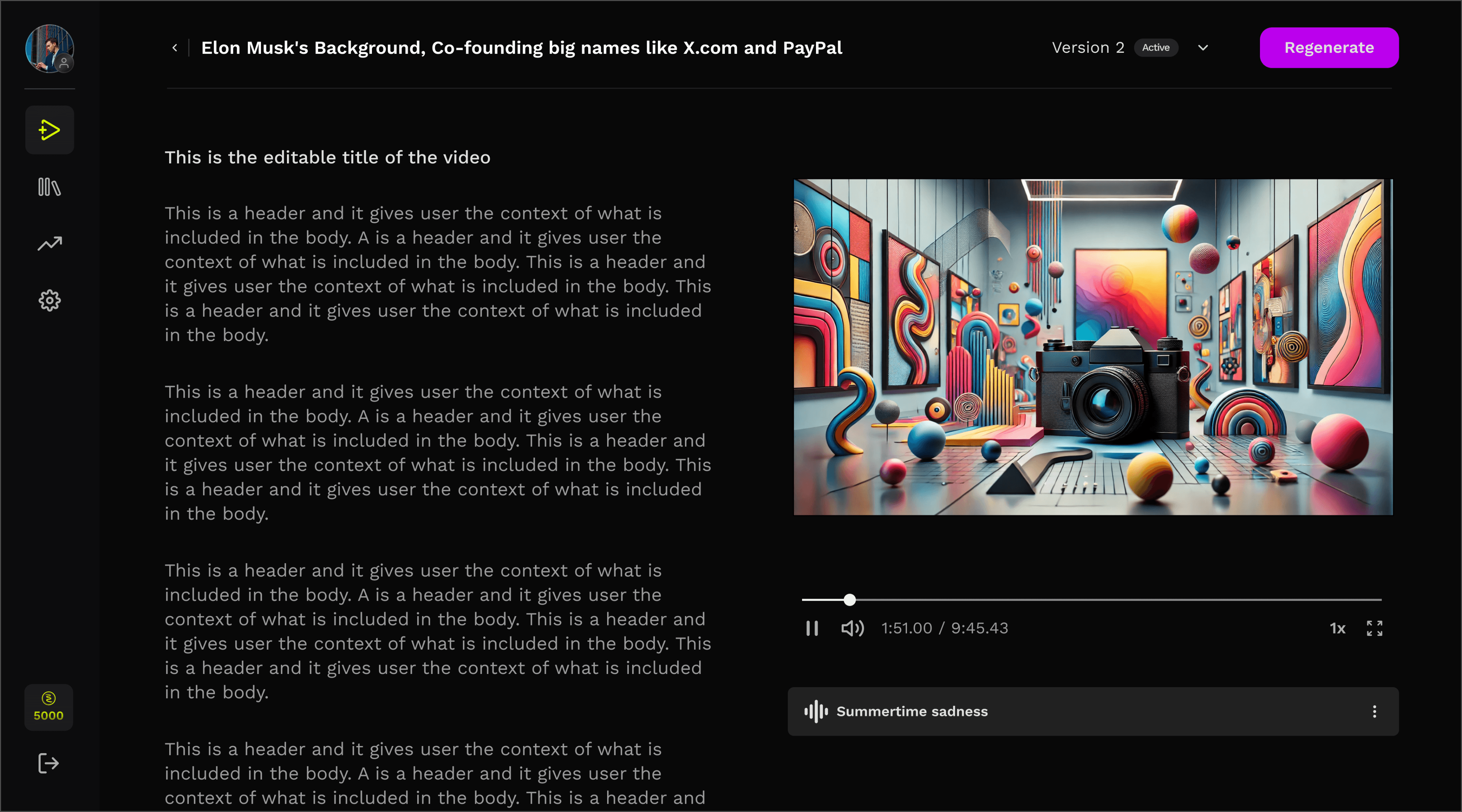
Step by step design decision from inherited screen to the new screen.
BEFORE AND AFTER
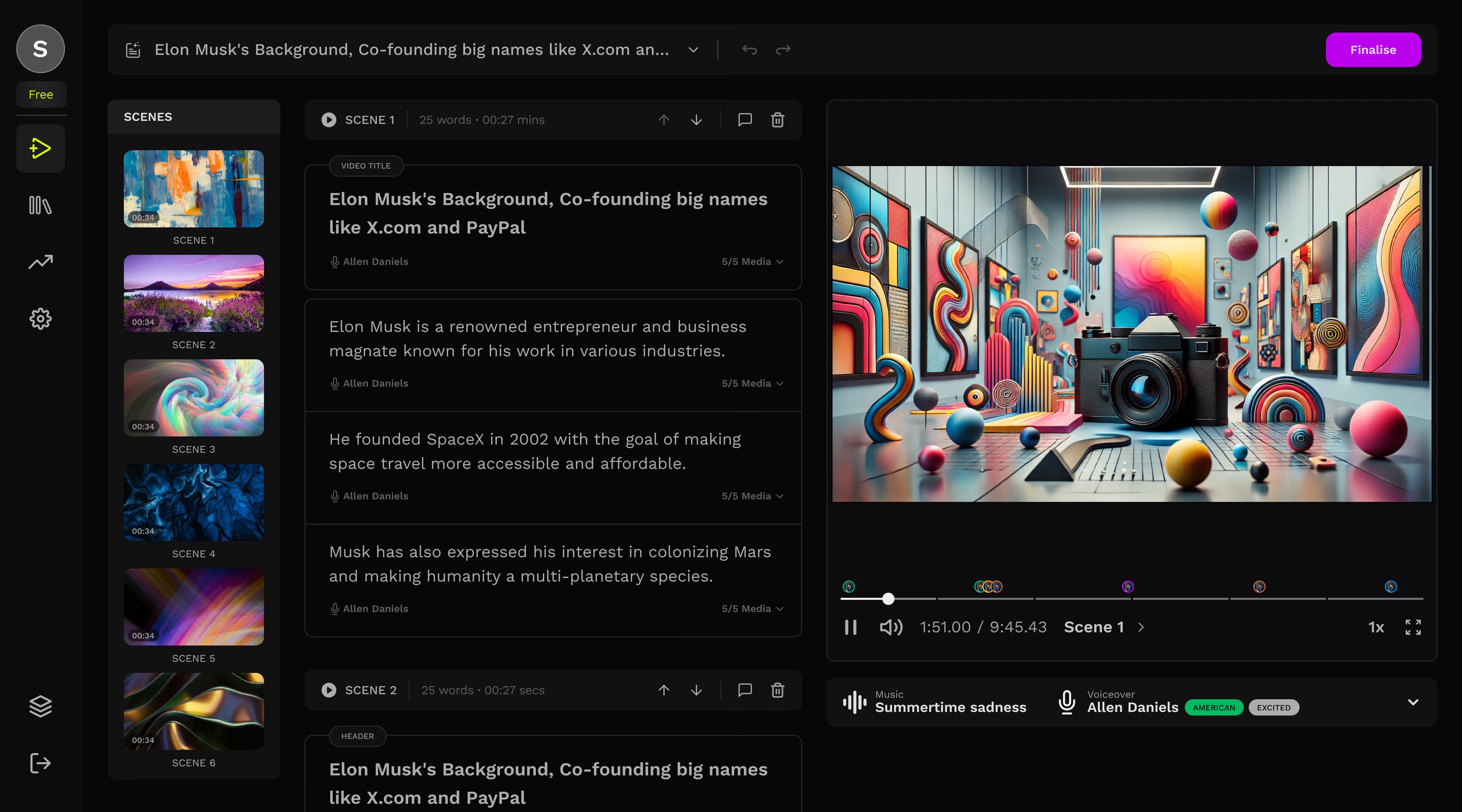
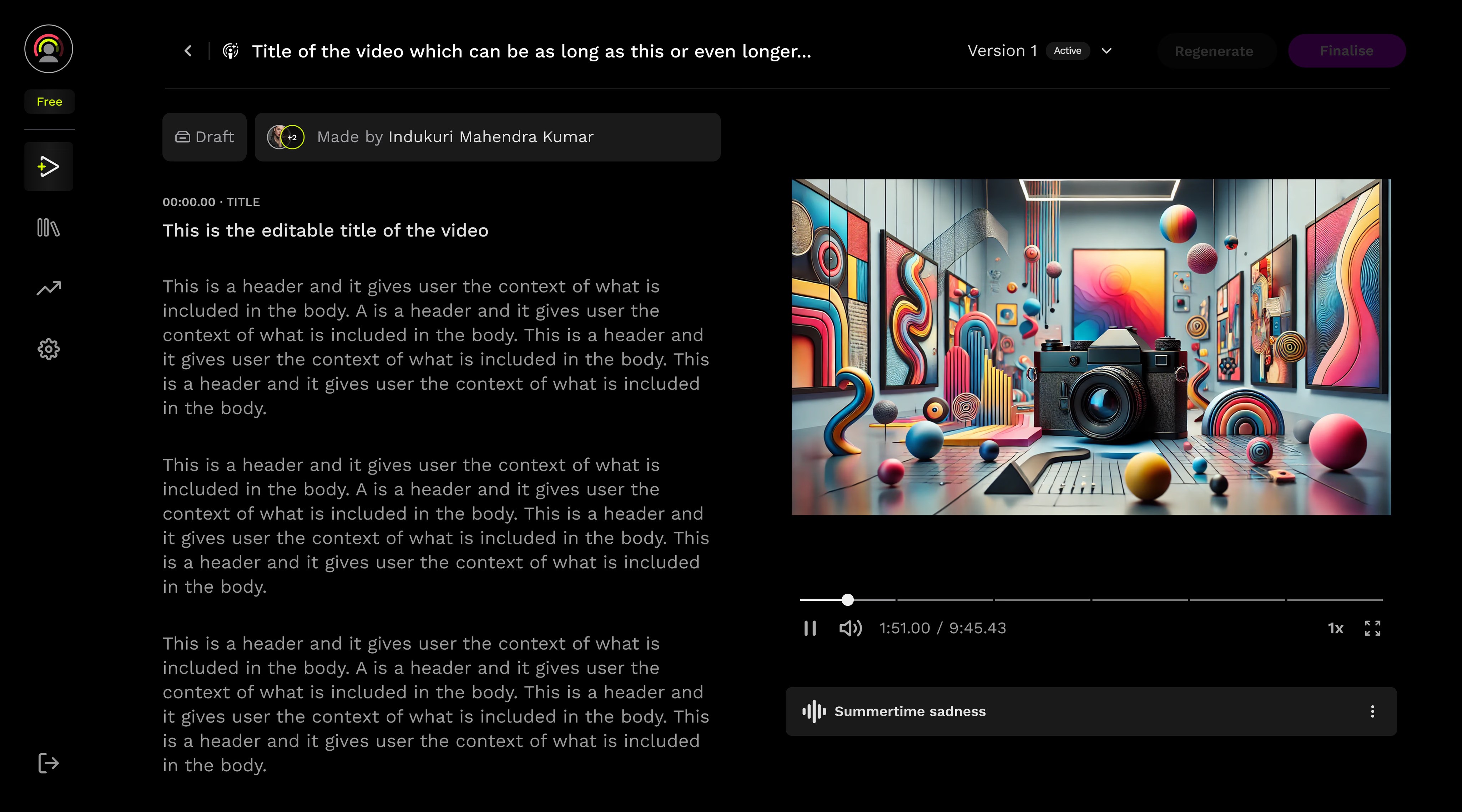
DESIGN DECISIONS
BREAKING DOWN THE CONTENT
1
The script is divided into distinct scenes, each clearly marked with its corresponding timestamp.
2
The new seek bar also divides the entire timeline into scenes, matching the division on the content side... making navigation easier.

1
2
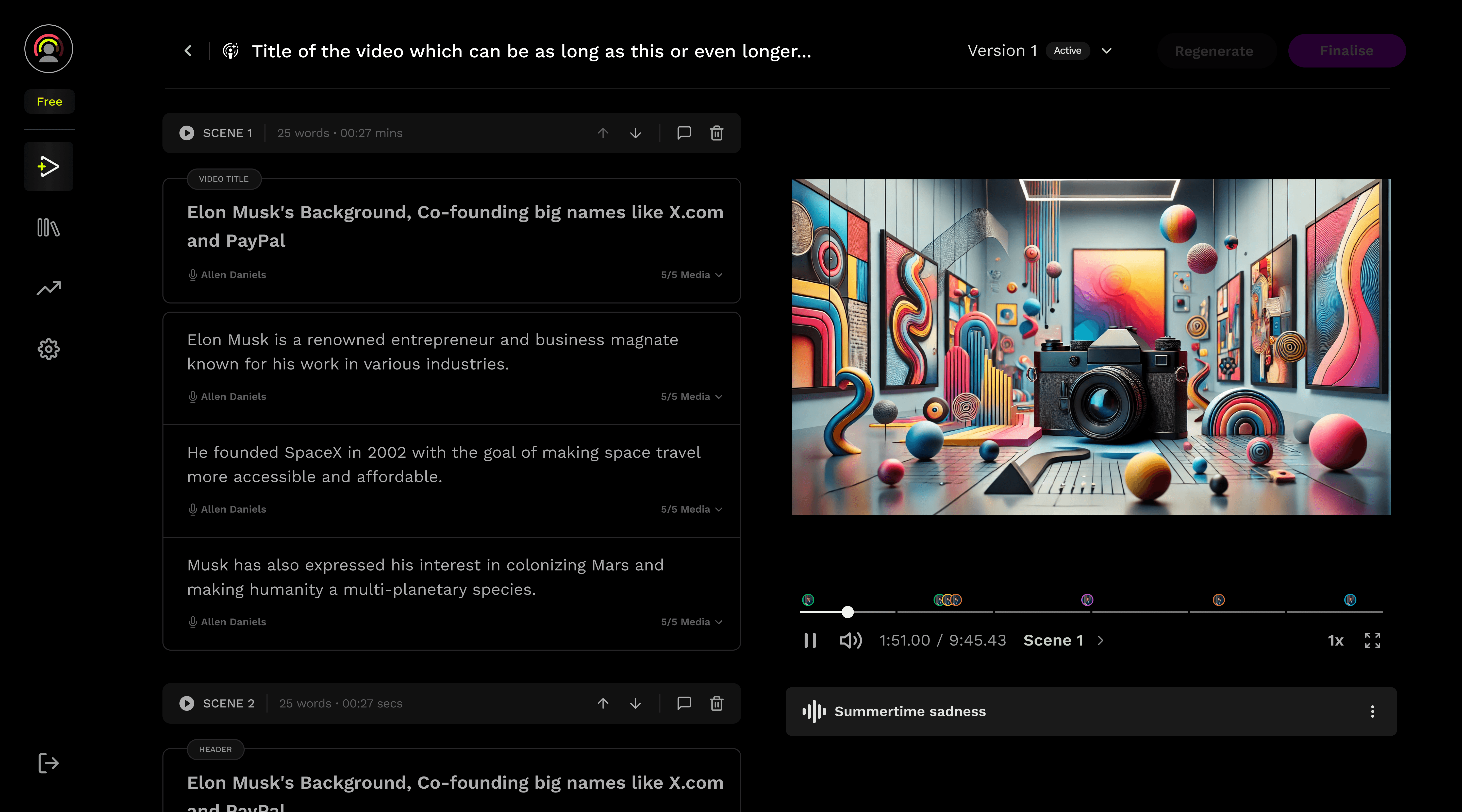
4
3
adding structure
3
The scene functionality bar displays detailed information such as duration and word count. A play icon allows users to preview individual scenes, offering more precise control over video navigation
4
Voiceover and media assets are now embedded directly within each fragment, allowing instant access without the need to open the full scene properties
enhanced navigation
5
A new scene panel was introduced, significantly improving the efficiency of navigating between scenes.
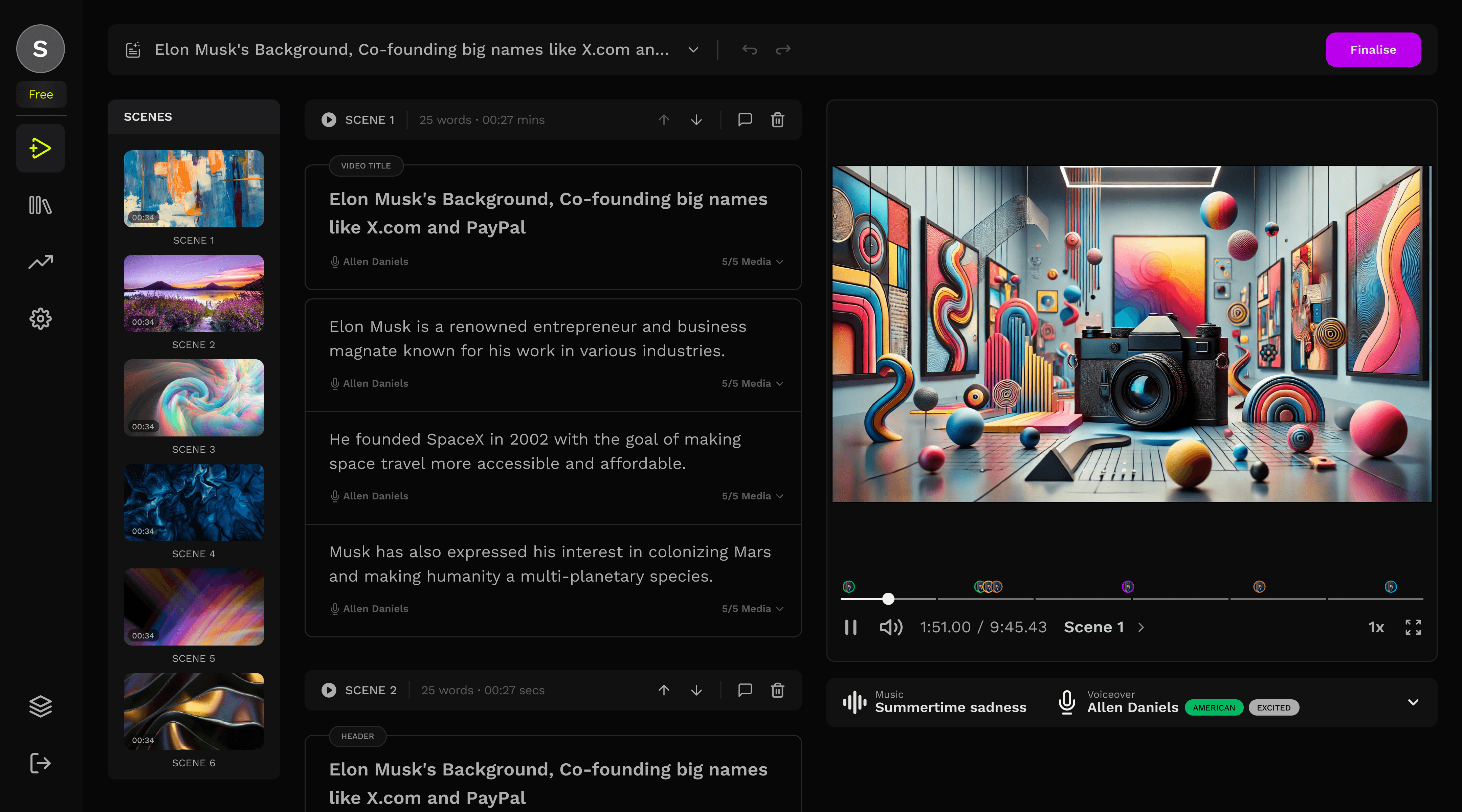
5
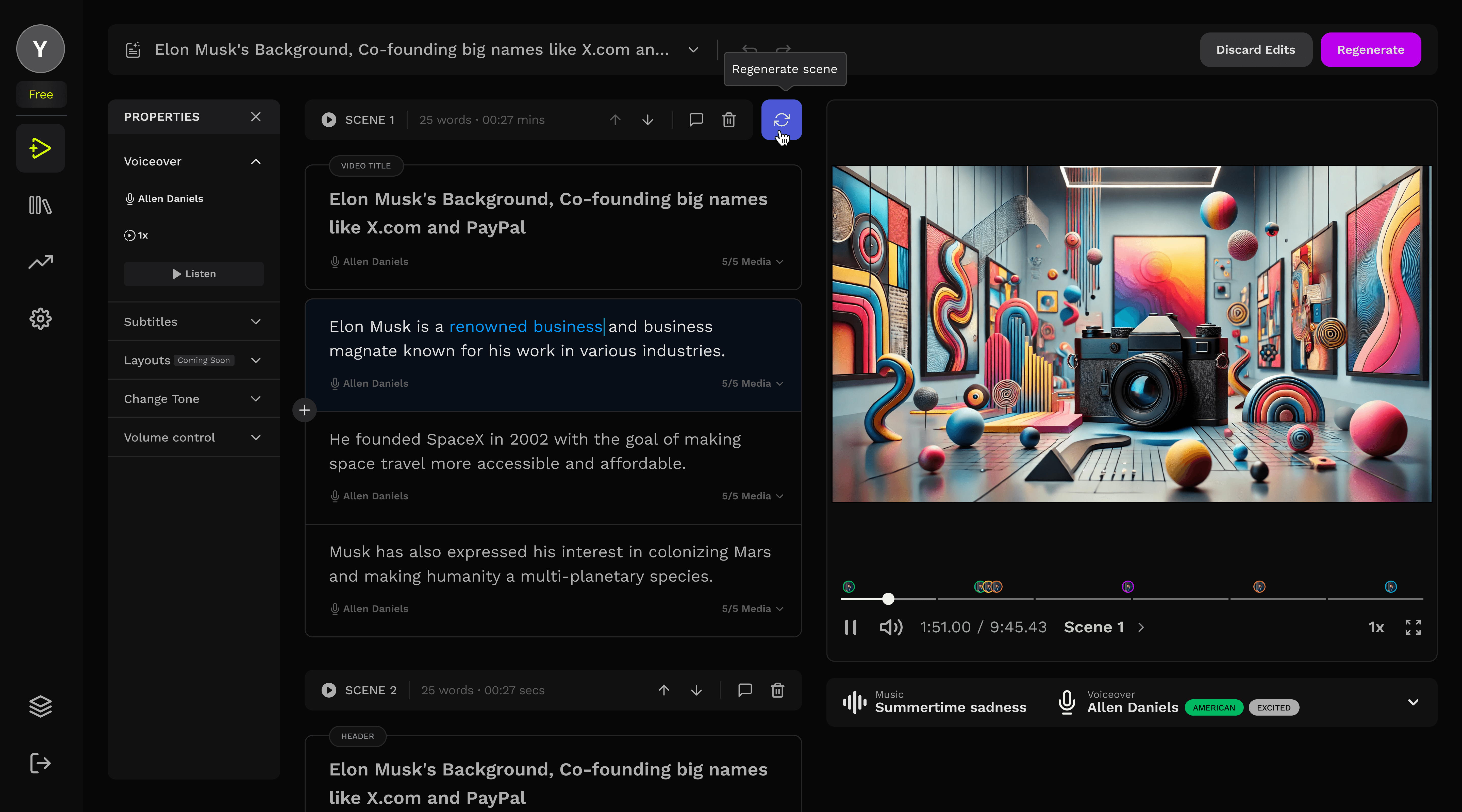
6
scene level regeneration
6
Whenever the user makes an edit to a scene or fragment, a regeneration icon appears next to the scene functionality bar, indicating that changes have been made and the scene can be regenerated.
background regeneration
7
The scene blocks itself while getting regenerated in the background
You can see the status of the scene change as its details collapse.
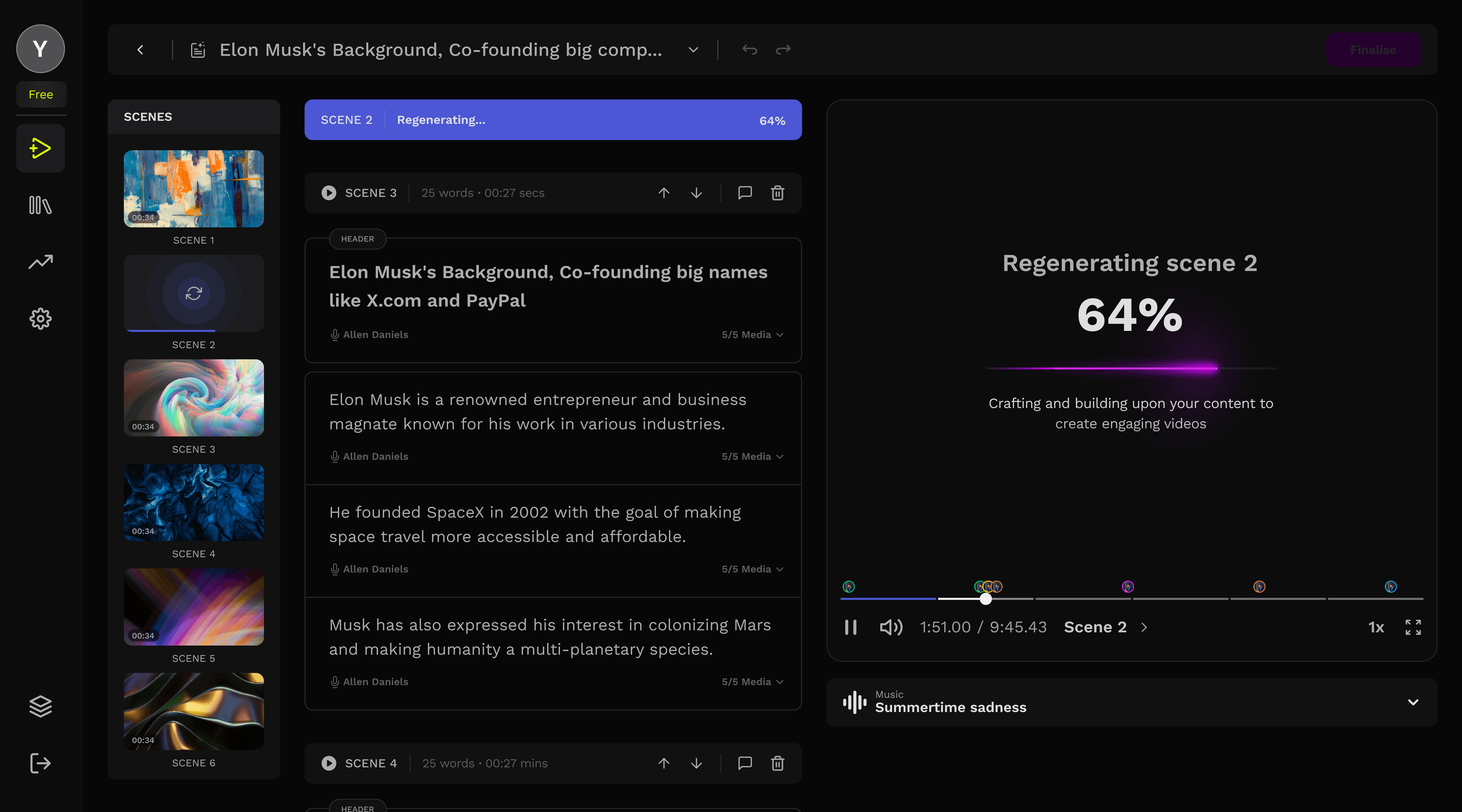
7
06
Impact
Improvement in time to value, retention rate and decrease in drop offs, all
resulting in the NPS turning positive
mins
15
avg. time to value
Driven by faster editing workflows.
%
27
retention rate
D7 retention improved more than expected
%
41
drop offs
Drop-off at editing stage reduced by ~22%
07
Reflections
The idle time shifts from frustration to invisible, where users can make edits in parallel while the other segment/scenes were being regenerated.
Architectural thinking
Sometimes the solution isn't optimizing existing systems but it's fundamentally restructuring the approach
Perceived vs. actual time
Background processing transforms waiting from frustration to productivity, even when total time remains constant
The end

Yashvardhan Bhardwaj
Senior User Experience Designer
Designed with ❤️, Logic, and AI.
Copyright ©2026. All rights reserved.