
BIT SIZE CASE STUDY
Designing Rizzle for speed
35% faster design-to-dev handoffs. 71% less QA churn. Built in six weeks by treating inconsistency as an infrastructure problem, not a style problem.

01
Starting point
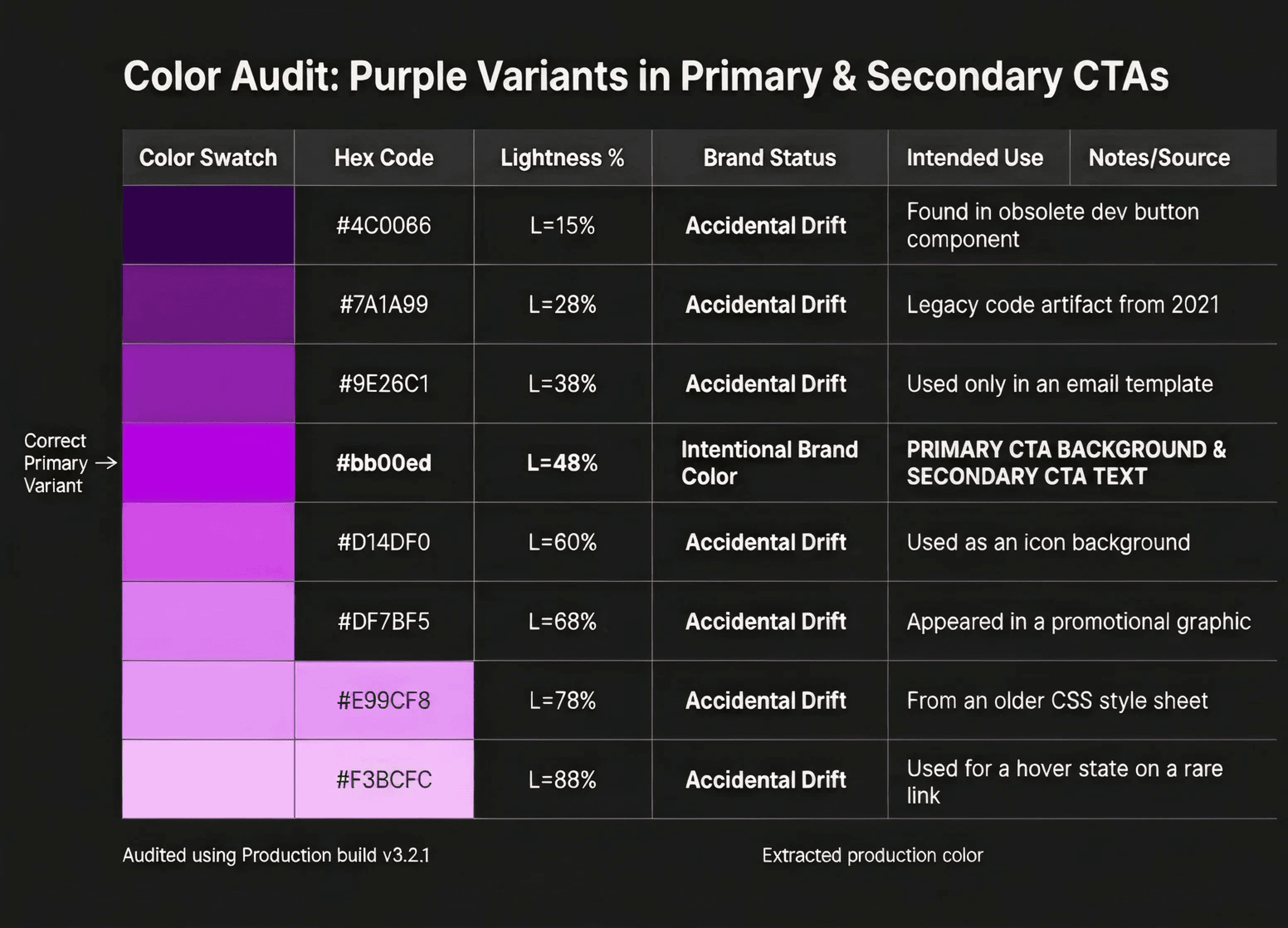
We ran a two-week visual audit across every live screen in the platform — 140 screens across the creator dashboard, mobile app, and marketing surfaces. The goal was to quantify the drift before designing a fix for it.
AUDIT
8 distinct blue values in production code
4 different button height values across features
3× longer QA on cross-team features vs. single-team
~40%of design time re-deciding existing patterns
02
Scope
With a team of seven and a six-week window, the scope had to be ruthless. We made explicit decisions about what to defer — not just what to build. Deferring clearly is as important as building clearly.
DEFFERED FOR LATER
LIGHT mode token variants
Zero light surfaces existed in production. Designing a dual-mode token architecture for a hypothetical future would have doubled scope with no near-term payoff.
Storybook / code components
Engineering velocity wasn't the bottleneck — design consistency was. A code library before a stable design token layer would lock in the wrong values.
03
Foundation
Survey-based research across three user archetypes — daily workers, occasional riders, and tourists — supplemented by contextual observation across 4 metro stations during peak and off-peak hours.
Token architecture
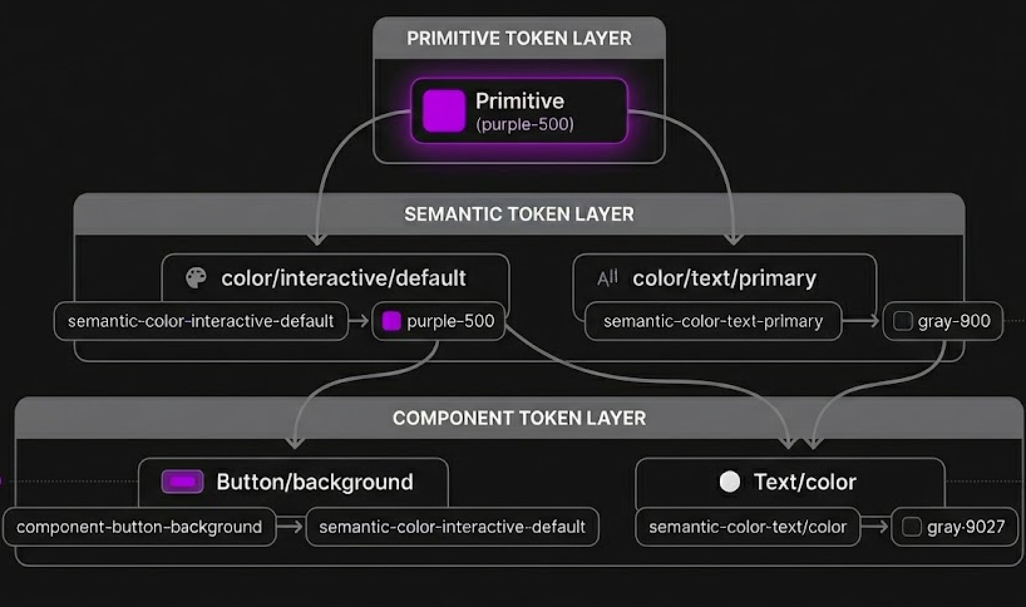
We separated primitive values from semantic tokens. Primitives define the raw palette. Semantic tokens assign intent. A component never references a primitive directly — only a semantic token. This means the entire product can re-theme by changing one layer, not hundreds of component values.
Color
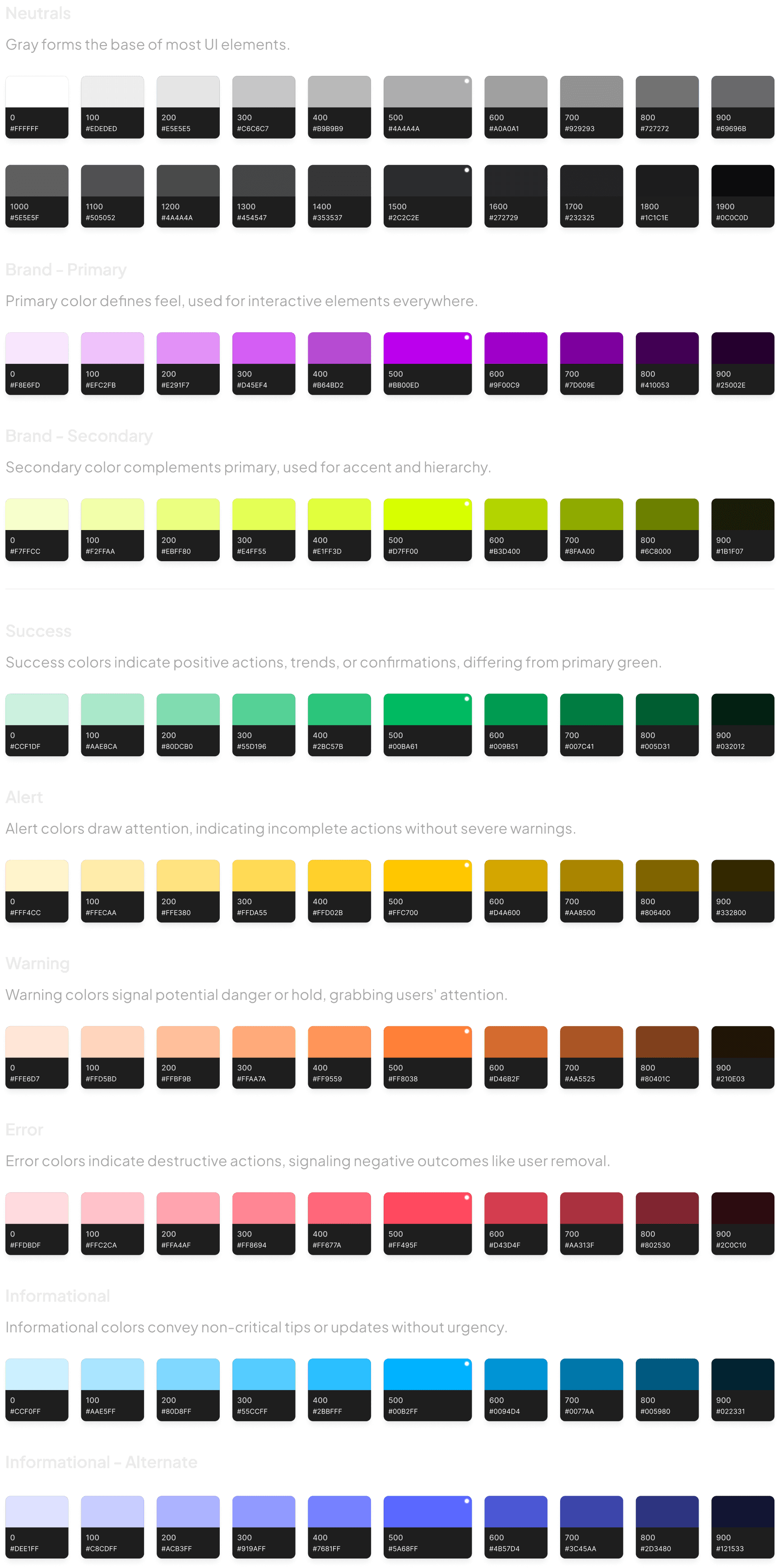
Sixteen production blues collapsed into six semantic families: brand, interactive, destructive, success, warning, and muted. Each family defines four states — default, hover, pressed, and disabled — applied once in the token layer and consumed everywhere.
Typography
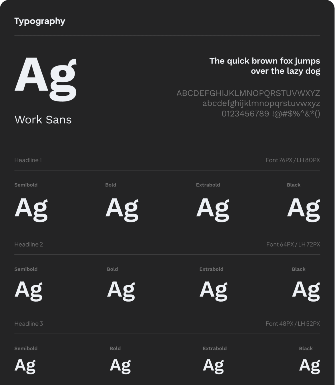
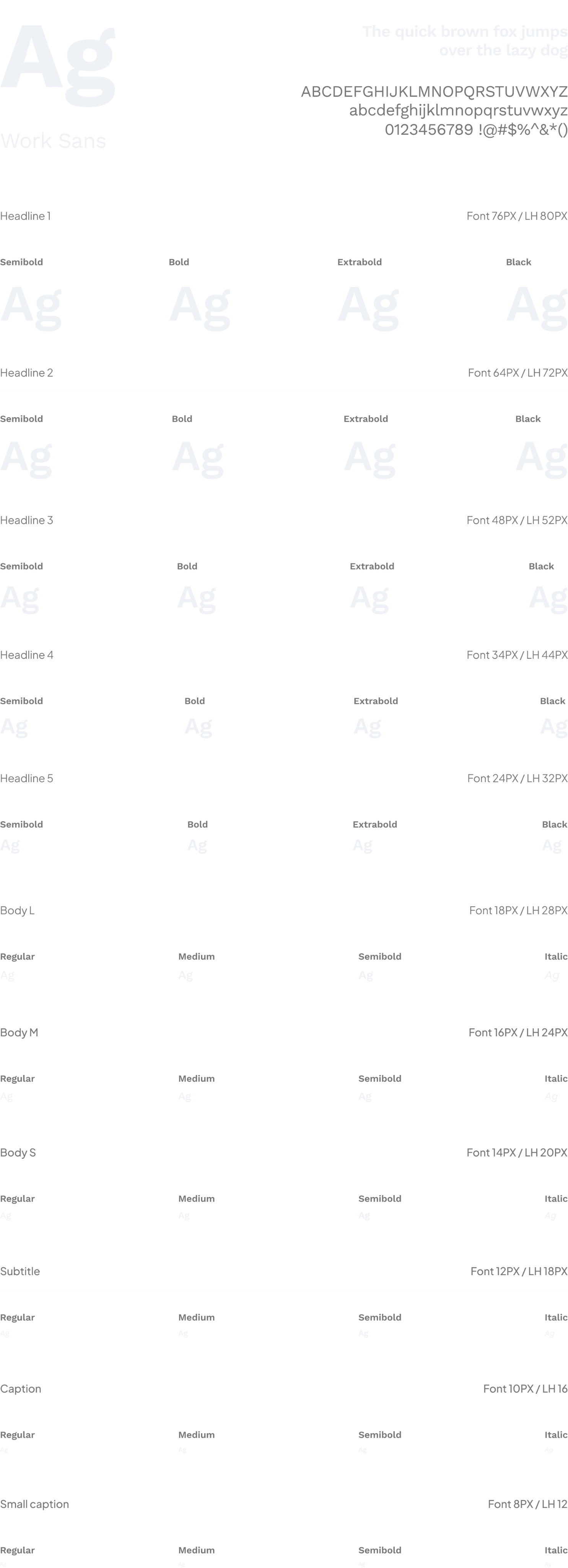
Replaced freeform font sizing with a 10-step type scale anchored to a 4px base grid. Display, heading, body, and label roles each carry a defined size, line-height, and weight — no ad-hoc values permitted.
Layout & spacing
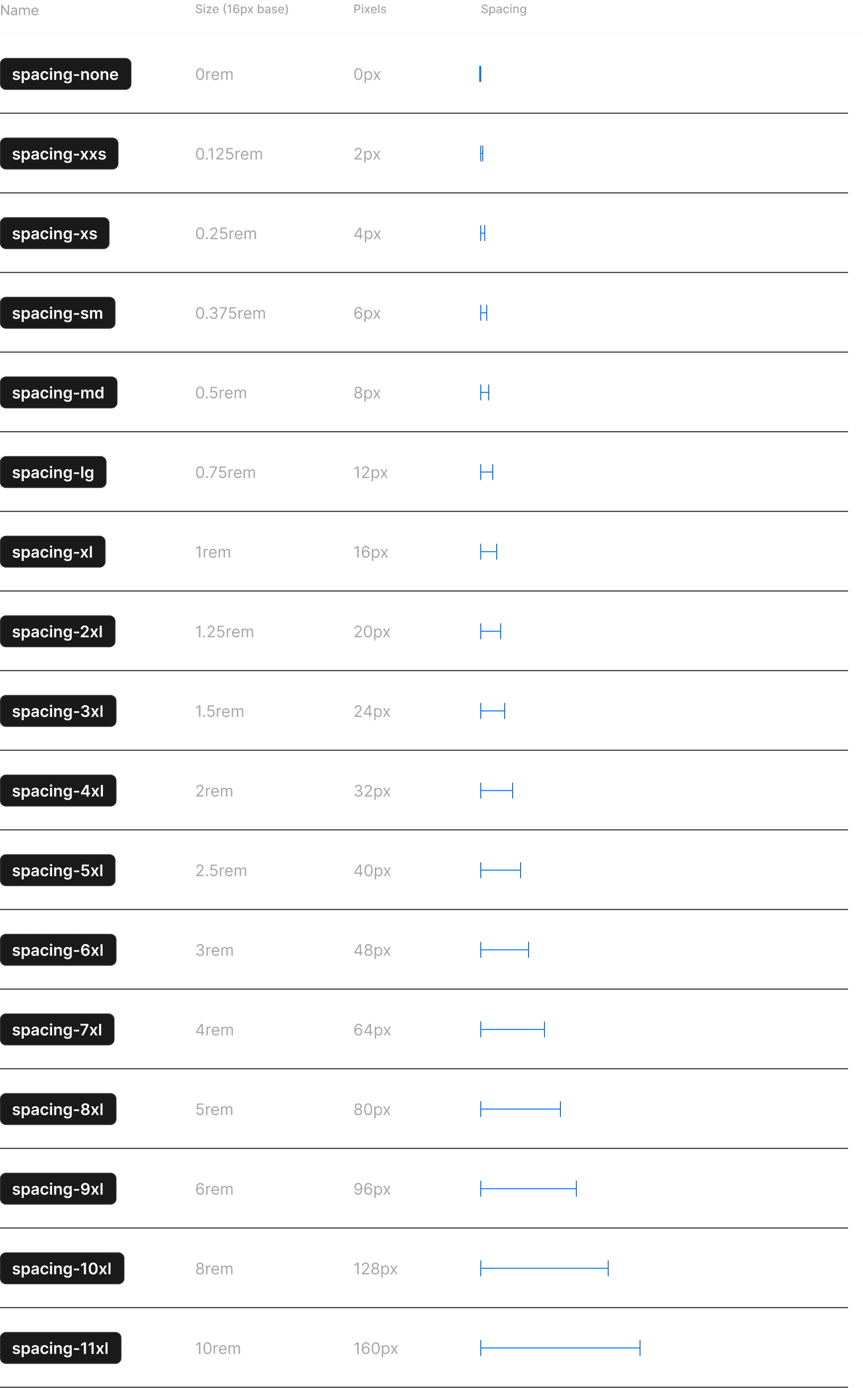
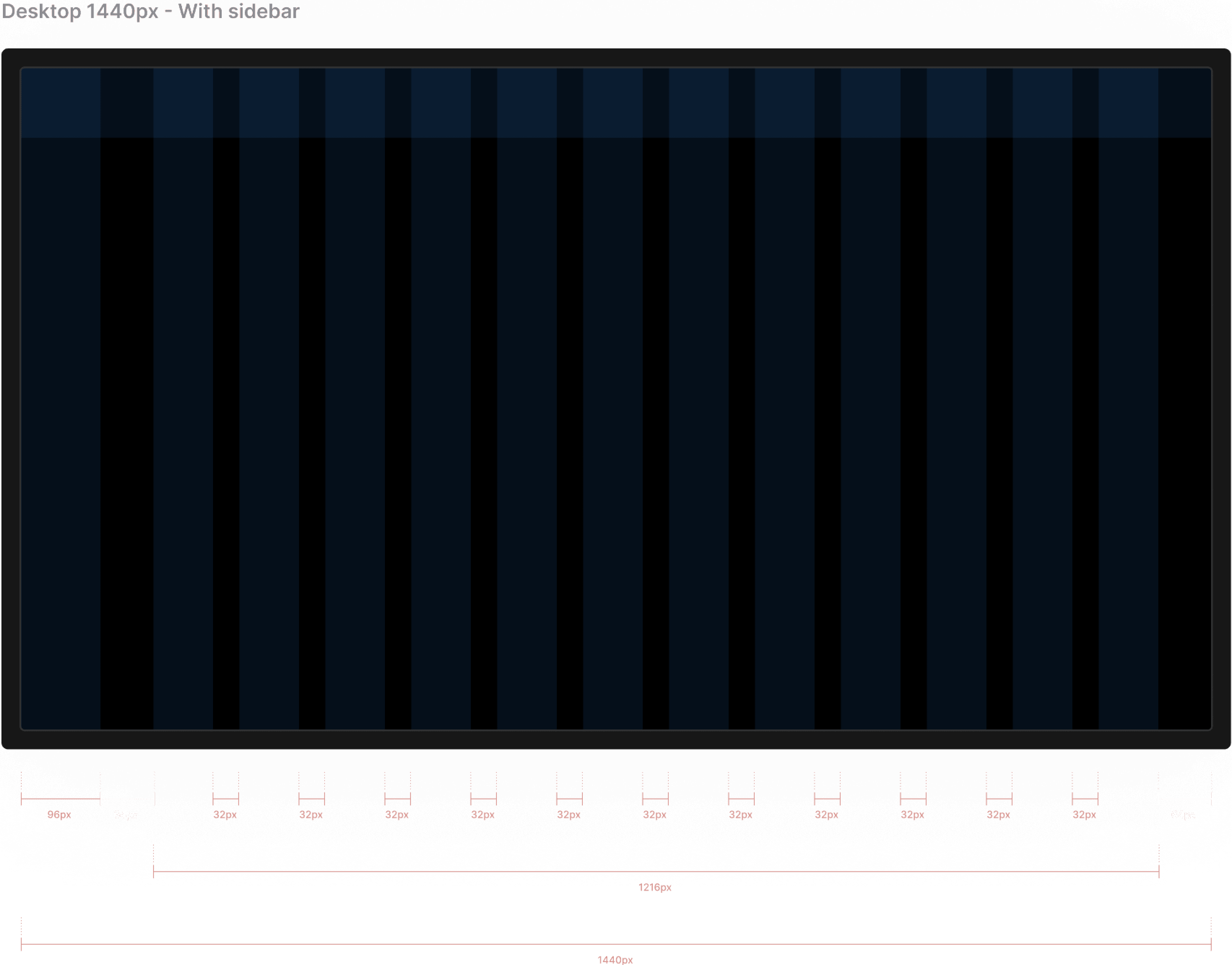
A strict 4px-base scale: 2, 4, 8, 12, 16, 24, 32, 48, 64, 96px. Radius followed a three-tier system: sm (4px), md (8px), lg (16px). No intermediate values. This single constraint eliminated the most common category of QA corrections.
04
Components
No component may hardcode a value already defined in a token. Violations surfaced in Figma review before they could reach production.
ATOMIC DESIGN SYSTEM

Atoms

Molecules
Organisms
Templates

Pages
MOLECULES
Functional units built from atoms. Molecules have exactly one job and expose only the props needed to do it.
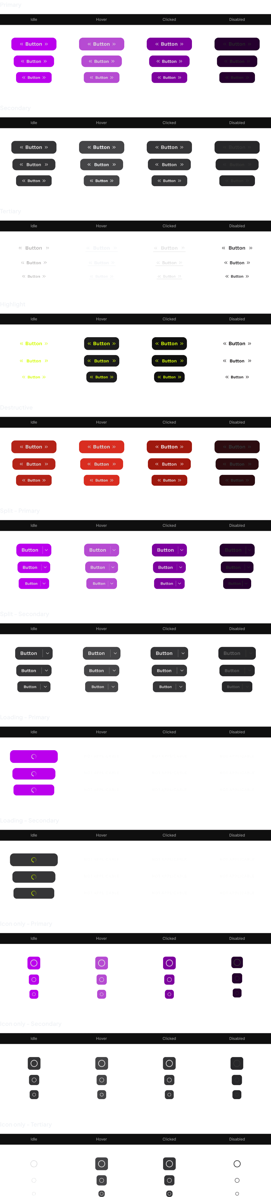
Buttons — 5 variants, 3 sizes, 4 states
Text fields — 6 interaction states
Dropdowns — single and multi-select
Badges, tags, and chips
Avatars and media thumbnails
Text fields states
Placeholder
Hover
Typing
Filled
Active
Disabled
Error
Alert
Success
Text Field *
0/20
Placeholder
This is a help text to assist the user.
Text Field *
0/20
Placeholder
This is a help text to assist the user.
Text Field *
0/20
Placeholder
|
This is a help text to assist the user.
Text Field *
0/20
Placeholder
This is a help text to assist the user.
Text Field *
0/20
|
Placeholder
This is a help text to assist the user.
Text Field *
0/20
Placeholder
This is a help text to assist the user.
Text Field *
0/20
Placeholder
This is error text to notify the user
Text Field *
0/20
Placeholder
This is alert text to notify the user
Text Field *
0/20
Placeholder
This is success text to notify the user
Dropdown states
Dropdown Field
*
[Name]: Selection
22
This is a help text to assist the user.
Dropdown Field
*
[Name]: Selection
22
This is a help text to assist the user.
Dropdown Field
*
[Name]: Selection
22
HEADER
Clear all
Dropdown Item
Dropdown Item
Dropdown Item
HEADER
Clear all
Dropdown Item
Dropdown Item
Dropdown Item
Dropdown Item
Dropdown Item
Dropdown Item
Dropdown Item
Dropdown Item
Dropdown Item
Dropdown Item
Dropdown Item
Dropdown Item
Dropdown Item
Dropdown Item
Dropdown Field
*
[Name]: Selection
22
This is a help text to assist the user.
Dropdown Field
*
[Name]: Selection
22
This is a help text to assist the user.
Dropdown Field
*
[Name]: Selection
22
This is a help text to assist the user.
Dropdown Field
*
[Name]: Selection
22
This is alert text to notify the user
Dropdown Field
*
[Name]: Selection
22
This is success text to notify the user
Placeholder
Hover
Open
Filled
Disabled
Error
Alert
Success
ORGANISMS
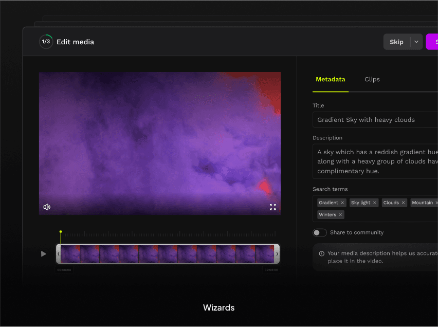
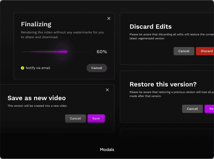
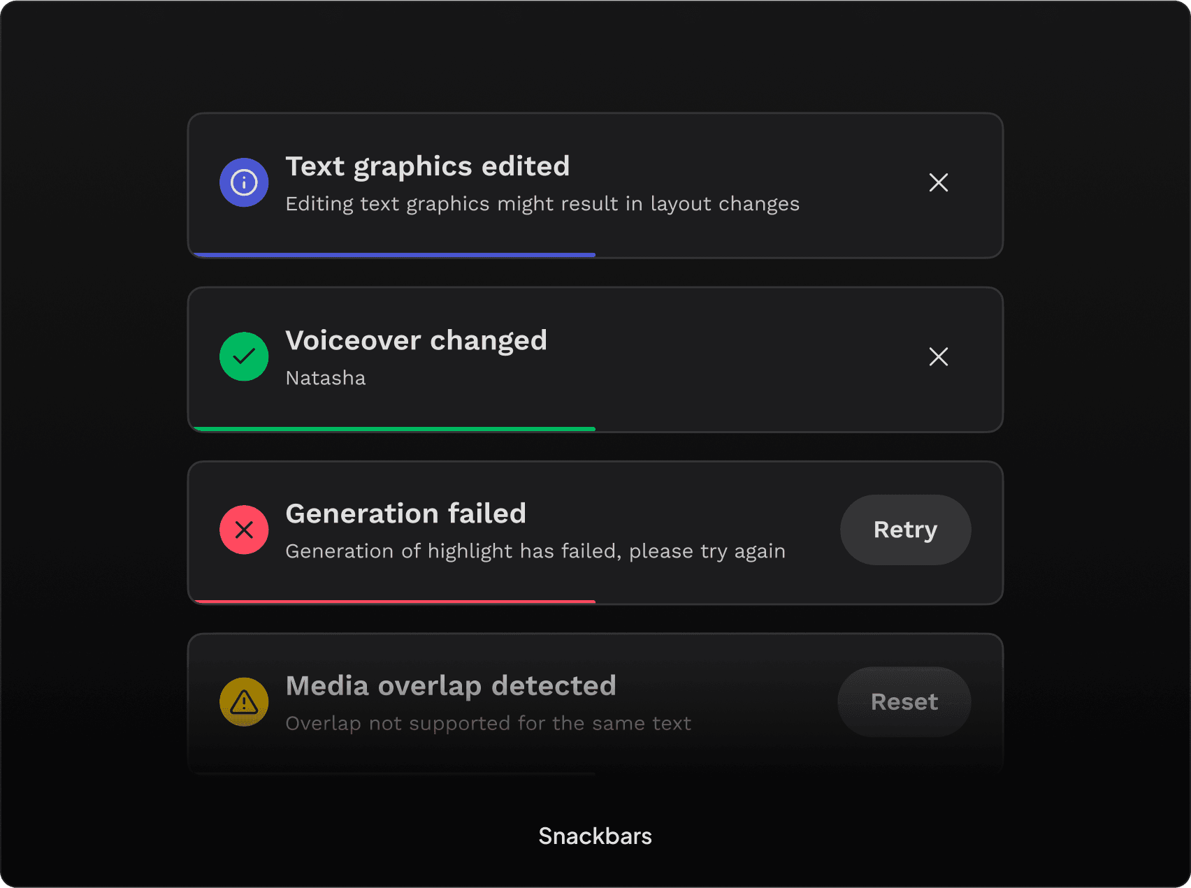
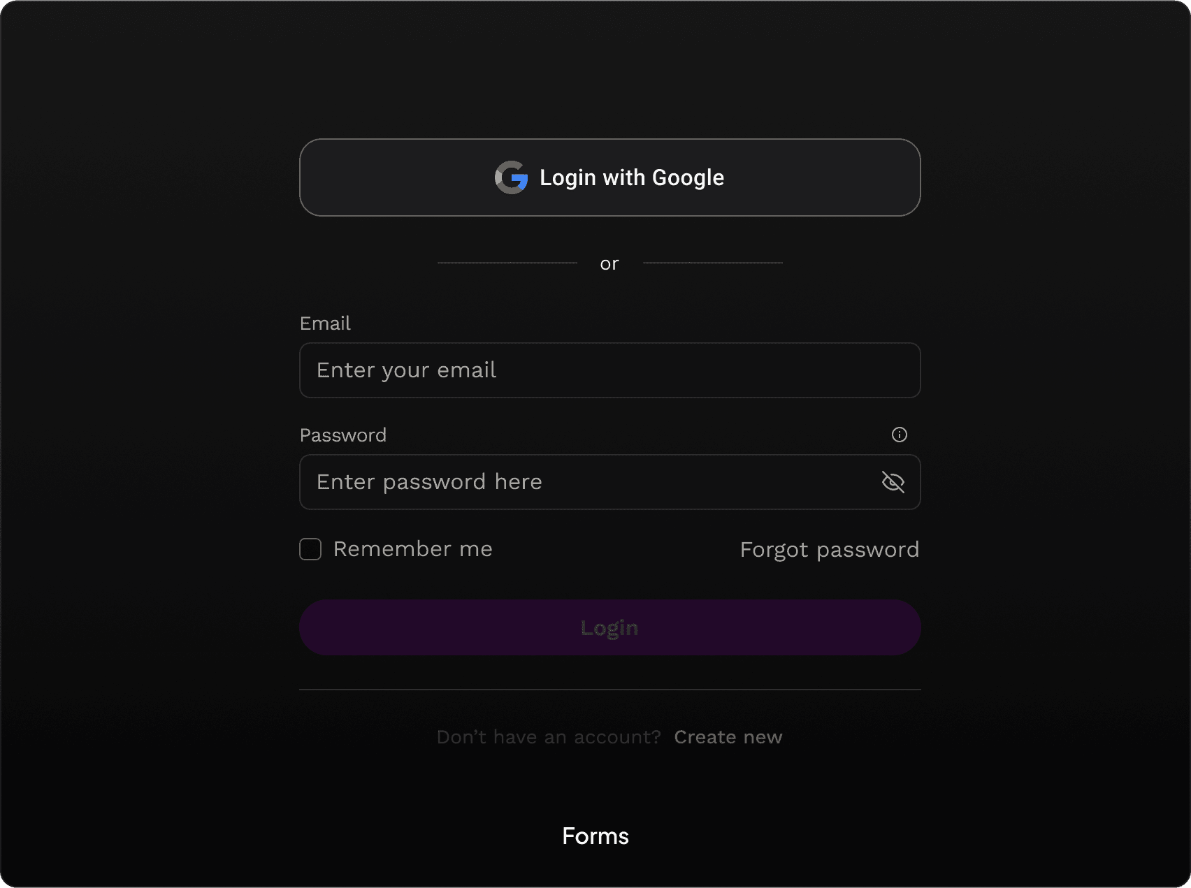
Templates & Pages
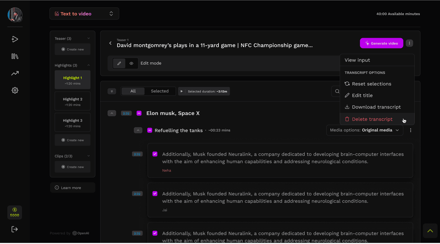
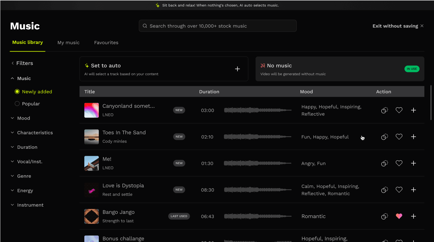
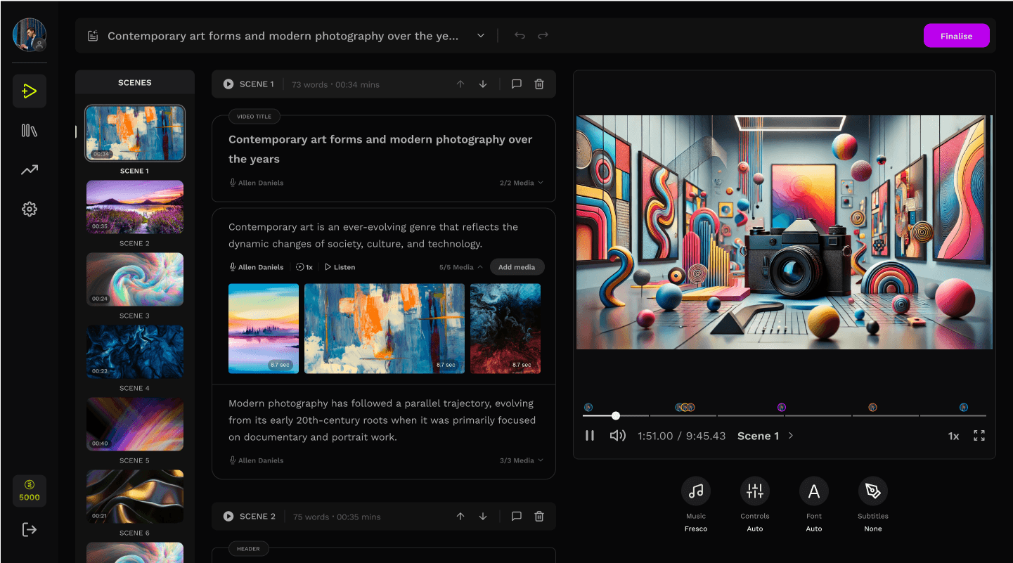
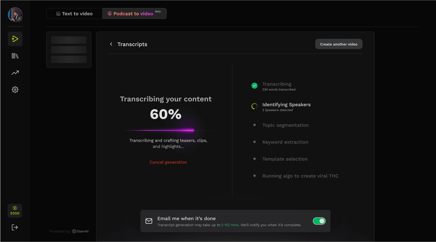
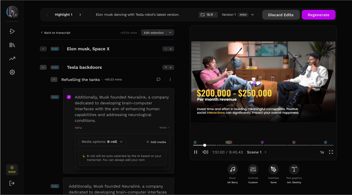
05
Adoption
We shipped in three phases. documentation as the byline and mentioned change protocols
Phased rollout
Rolled out the design system in phases — driving adoption before the component library was even complete.
Documentation
Treated documentation as a product, eliminating repetitive design decision bottlenecks within weeks of launch.
CHANGE PROTOCOLS
Built a zero-surprise migration process with audits, deprecation workflows, and guided upgrades across the entire v1 lifecycle.
06
Impact
Outcomes measured 60 days after full rollout, across the design team and the engineering team consuming the Figma library.
%
35
Faster design-to-dev handoff
Average Figma-to-implementation cycle time
%
61
Fewer QA cycles
Spacing, color, and component correction rounds
%
5
Breaking changes post-launch
Against a target of fewer than 15%
The end
hello
hola
salut
prego
namaste
ni hao
olá
ciao
s̄wạs̄dī
hallo

Yashvardhan Bhardwaj
Senior User Experience Designer
Designed with ❤️, Logic, and AI.
Copyright ©2026. All rights reserved.
Designed with ❤️, Logic, and AI.
Copyright ©2026. All rights reserved.
Yashvardhan Bhardwaj
Senior User Experience Designer
hello
hola
salut
prego
namaste
ni hao
olá
ciao
s̄wạs̄dī
hallo

These case studies goes deep and are built for bigger screens.
For the complete walkthrough, detailed interactions, and full visuals, view them on desktop.