
BIT SIZE CASE STUDY
Metro travel, redesigned
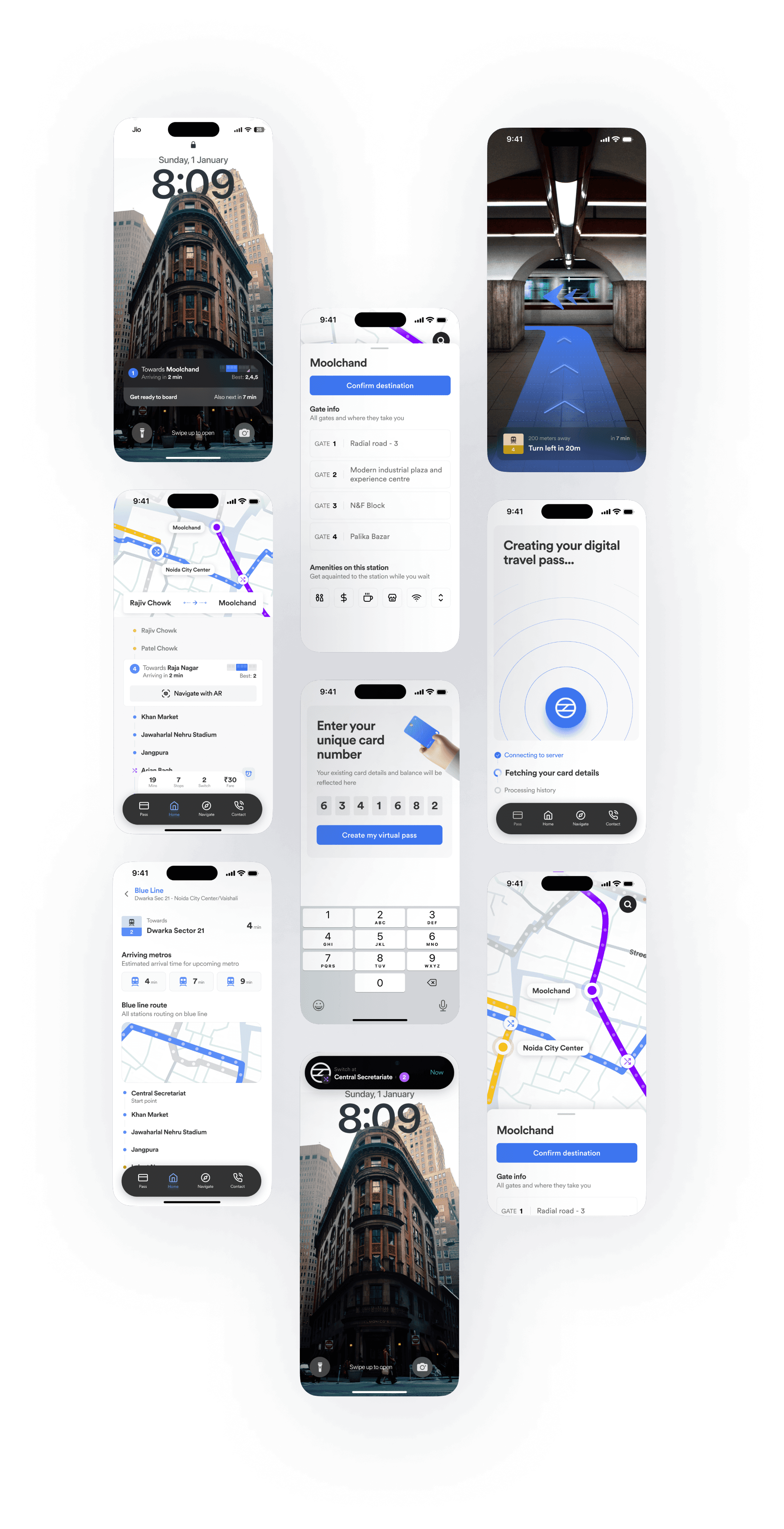
All you need metro app from first interaction to last exit. Covering navigation, ticketing, real-time schedules, and AR station wayfinding.
TYPE
Mobile App Design
PLATFORM
iOS & Android
Scope
Research & Design
TIMELINE
6 Weeks
01
Introduction
Metro systems carry millions of people daily yet the software supporting them is fragmented. Riders use Google Maps for routes, a separate transit app for schedules, a payment app for tickets, and nothing at all for station orientation. Metroute was designed to close that gap — one thoughtful product covering the journey from planning at home to reaching the right exit.
HIGH LEVEL OVERVIEW OF THE PLATFORM
02
Problem
Metro systems are built for volume, not for the person navigating them for the first time. The fragmented app ecosystem turns a 20-minute commute into a coordination problem — with 78% of surveyed users relying on 4 or more apps per journey.
USER JOURNEY
Before boarding
Route planning, line selection, ticket purchase, interchange logic
In the metro
Real-time updates, station notifications, alternative routes for delays.
After the TRIP
Exit identification, payment history, commute statistics, feedback collection.
core pain points
Map interpretation
Complex route maps overwhelm infrequent users and tourists.
Decision overload at junctions
Multiple platform choices with no contextual guidance.
Station tracking
Users lose count of stops and miss their destination.
Payment fragmentation
Inconsistent payment support creates friction at entry gates.
Exit confusion
Wrong exits force costly backtracks after leaving the train.
Crowding uncertainty
No visibility into peak-hour car-level occupancy before boarding.
03
Approach
Survey-based research across three user archetypes — daily workers, occasional riders, and tourists — supplemented by contextual observation across 4 metro stations during peak and off-peak hours.
RESEARCH
ONLINE RESEARCH
200+ respondents, 3 cities
Field observation
4 stations, peak + off-peak
Competitive audit
8 transit apps evaluated
USER TESTING
12 participants on prototype
USER FINDINGS & SURVEY DATA
78% used more than 2 apps per metro journey
34% had spent more than 10 mins finding the right platform
61% users waited at the queue to get tickets
91% expressed interest in a unified metro companion app

04
Designs
We explored three primary approaches to in-station navigation before settling on a layered model. Each was evaluated against the 6 pain points and tested with users in real metro environments.
INFORMATION ARCHITECTURE
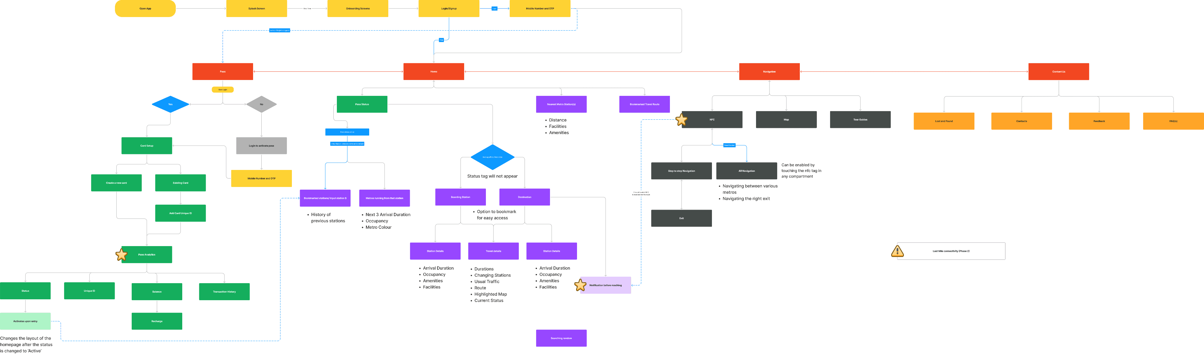
HAND DRAWN WIREFRAMING
Diverged into several possible interaction models, tested different layout structures

05
Final Designs
Walkthrough of the designs and the feature set of the proposed application
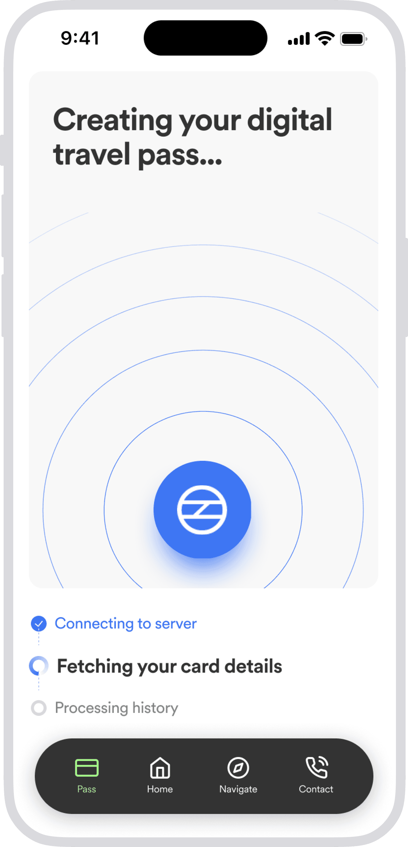
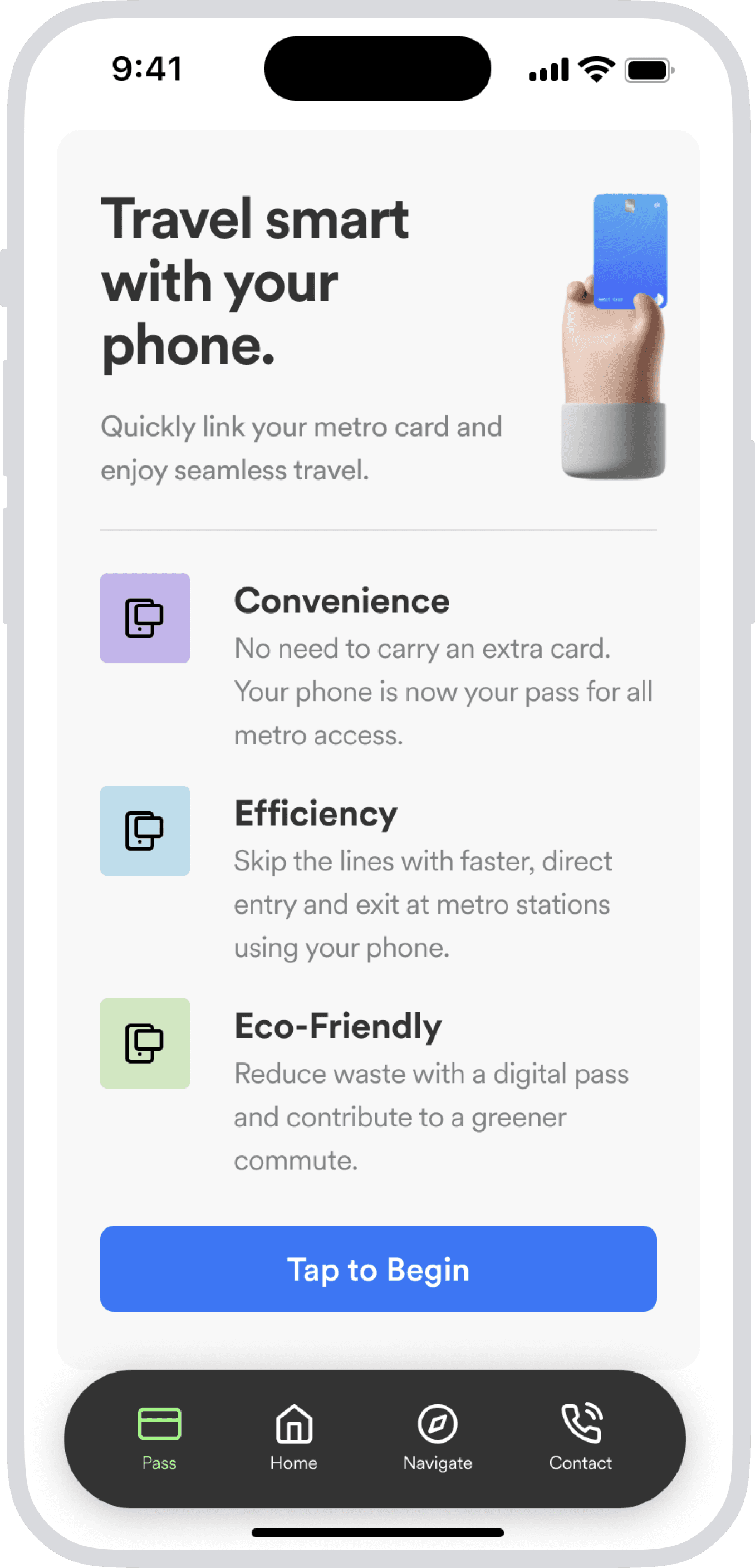
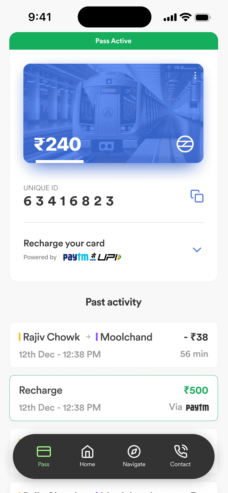
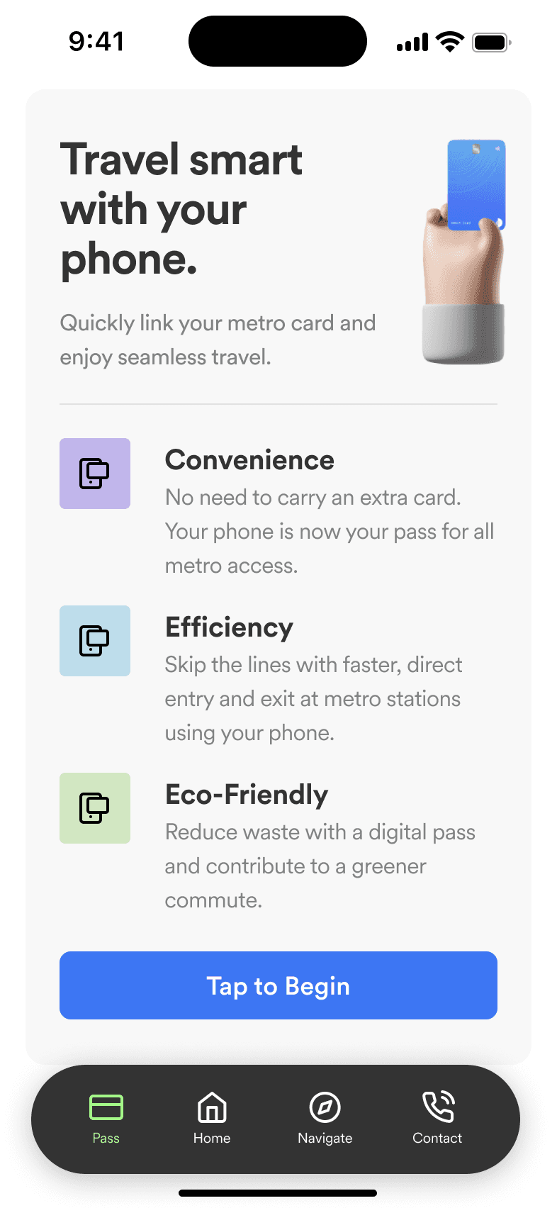
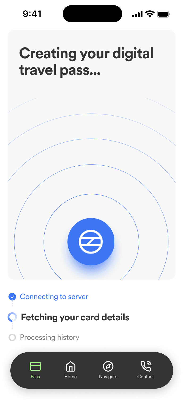
Smart Pass setup
Users create a digital transit pass in 3 steps. Existing card balance is carried over automatically, with no manual top-up required on day one.
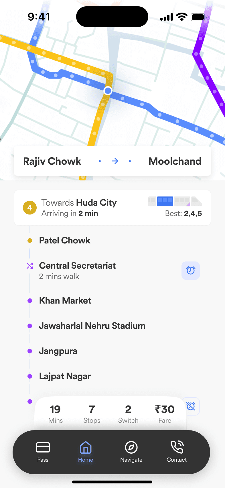
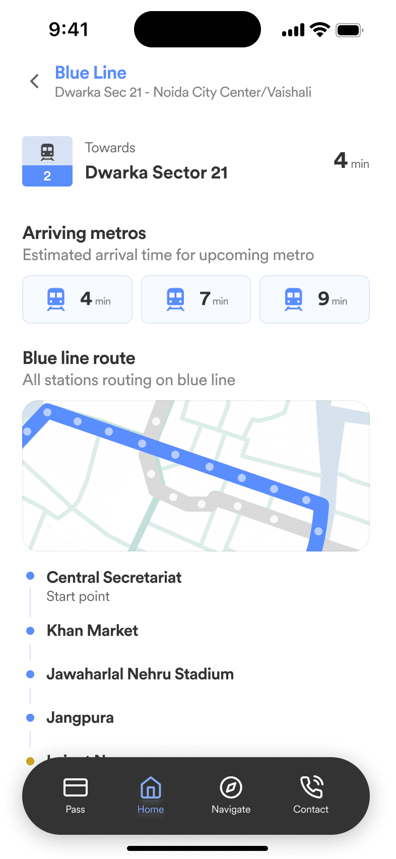
Journey Planner AND UPDATES
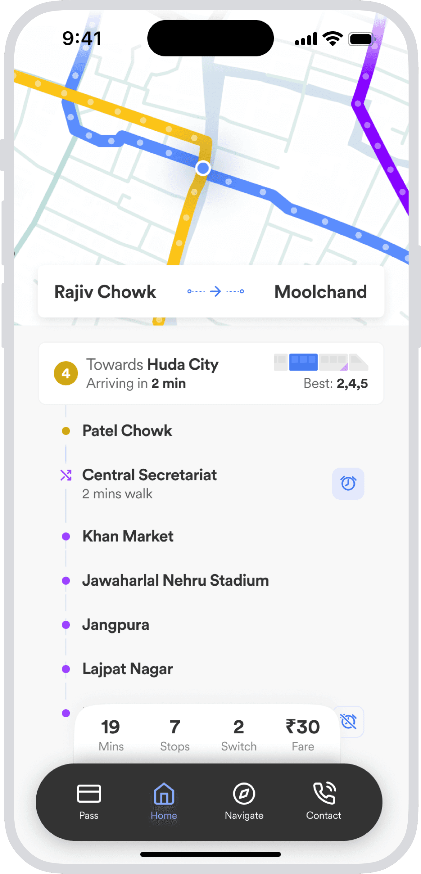
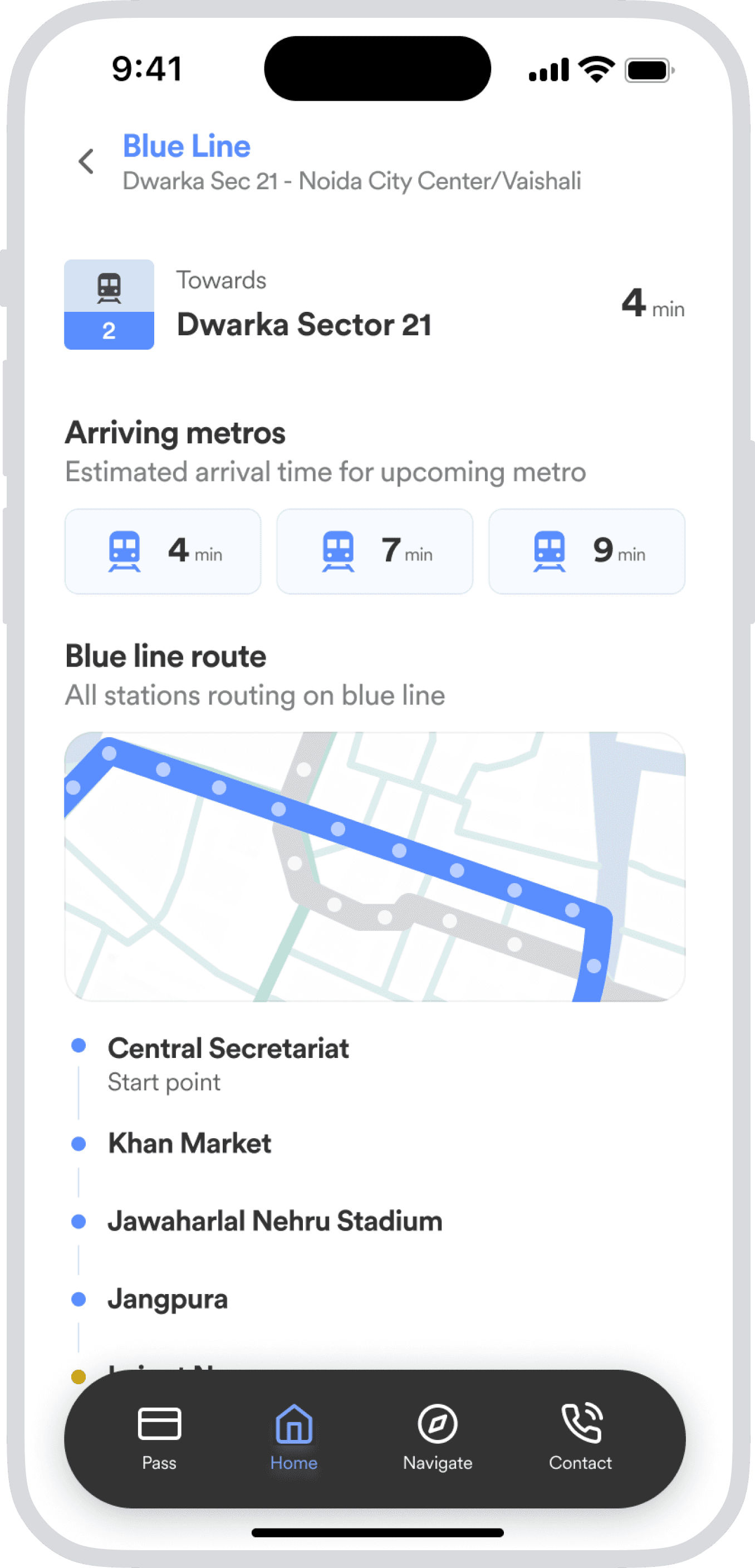
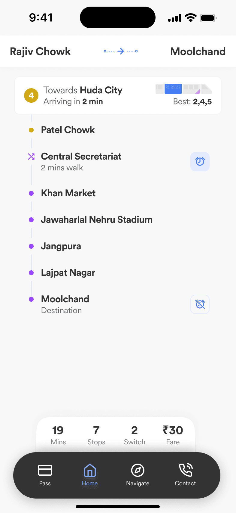
Door-to-door routing with live delay data, interchange countdowns, and car-level crowd forecasts: the three pieces users previously needed three apps to get.
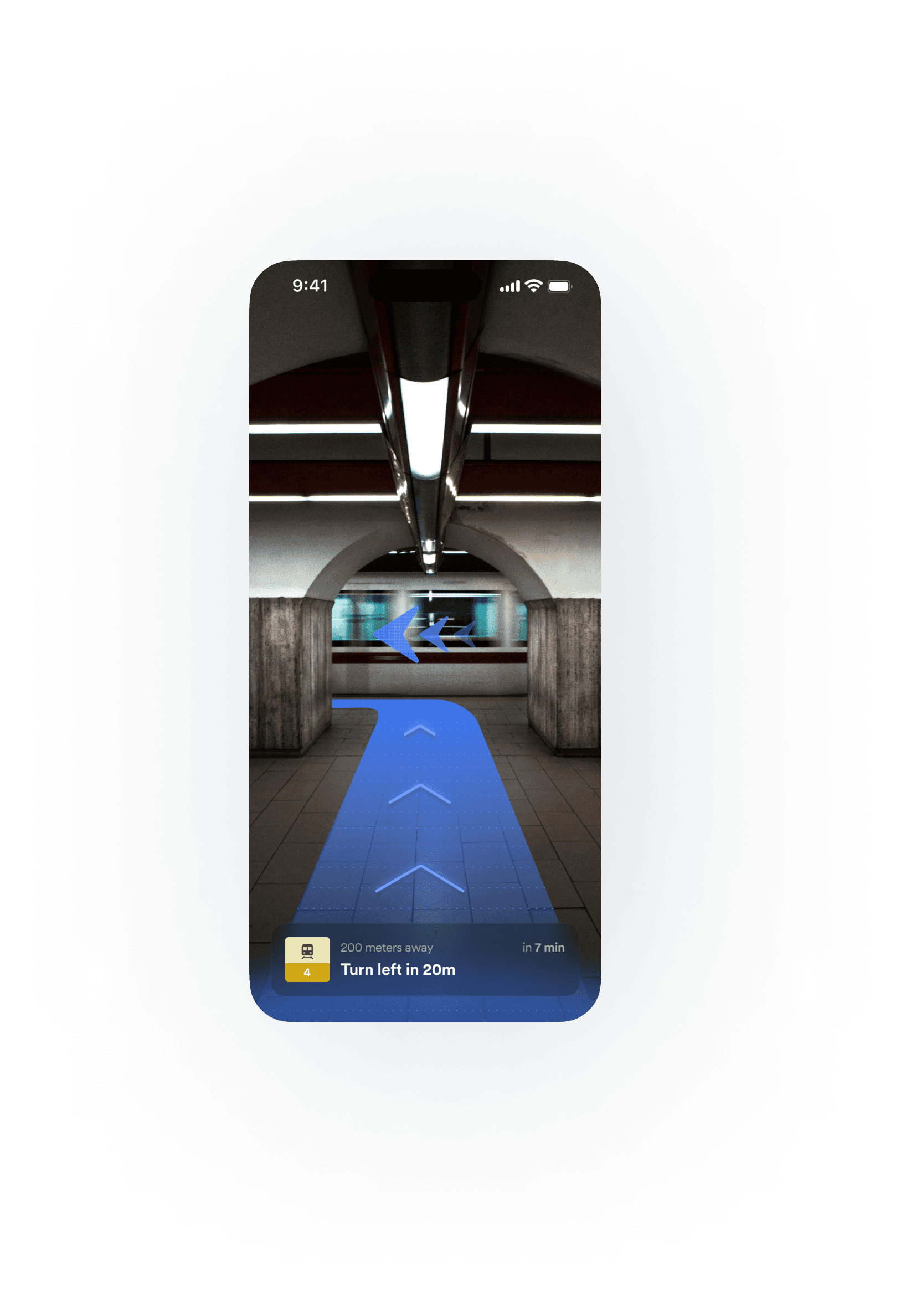
AR ASSIST
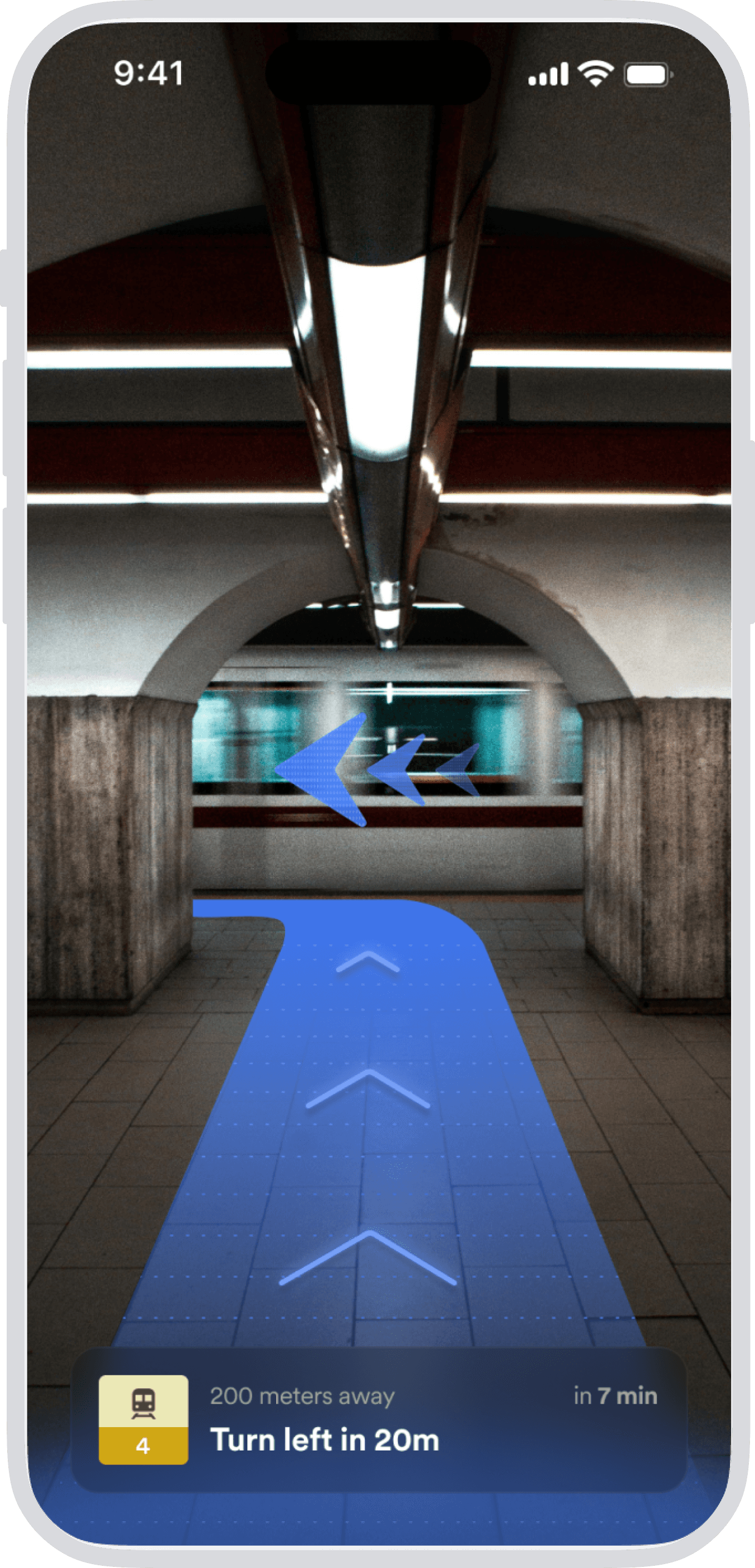
Camera-based AR overlays platform numbers, exit directions, and transfer distances on the real environment, resolving the single most-reported pain point.
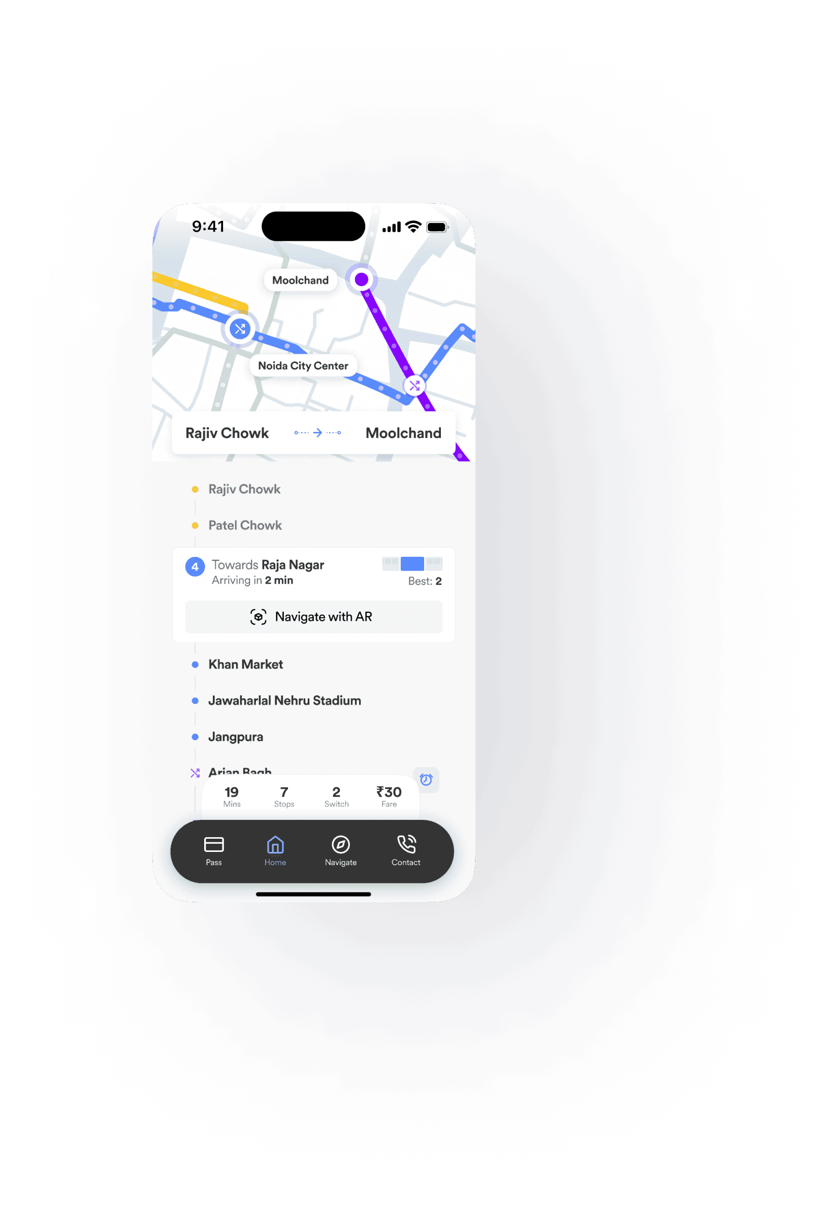
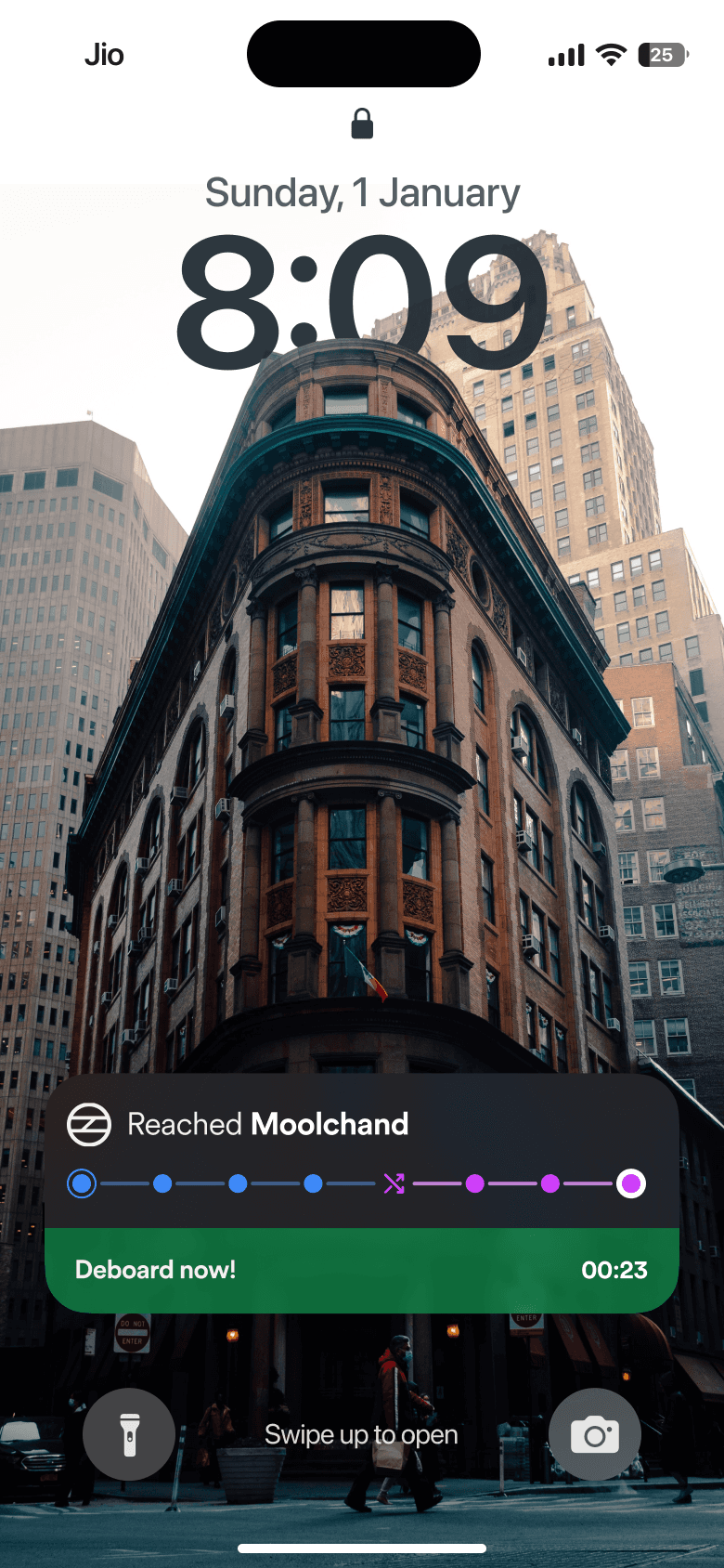
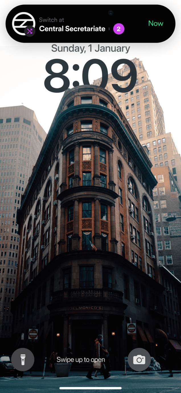
LIVE NOTIFICATION
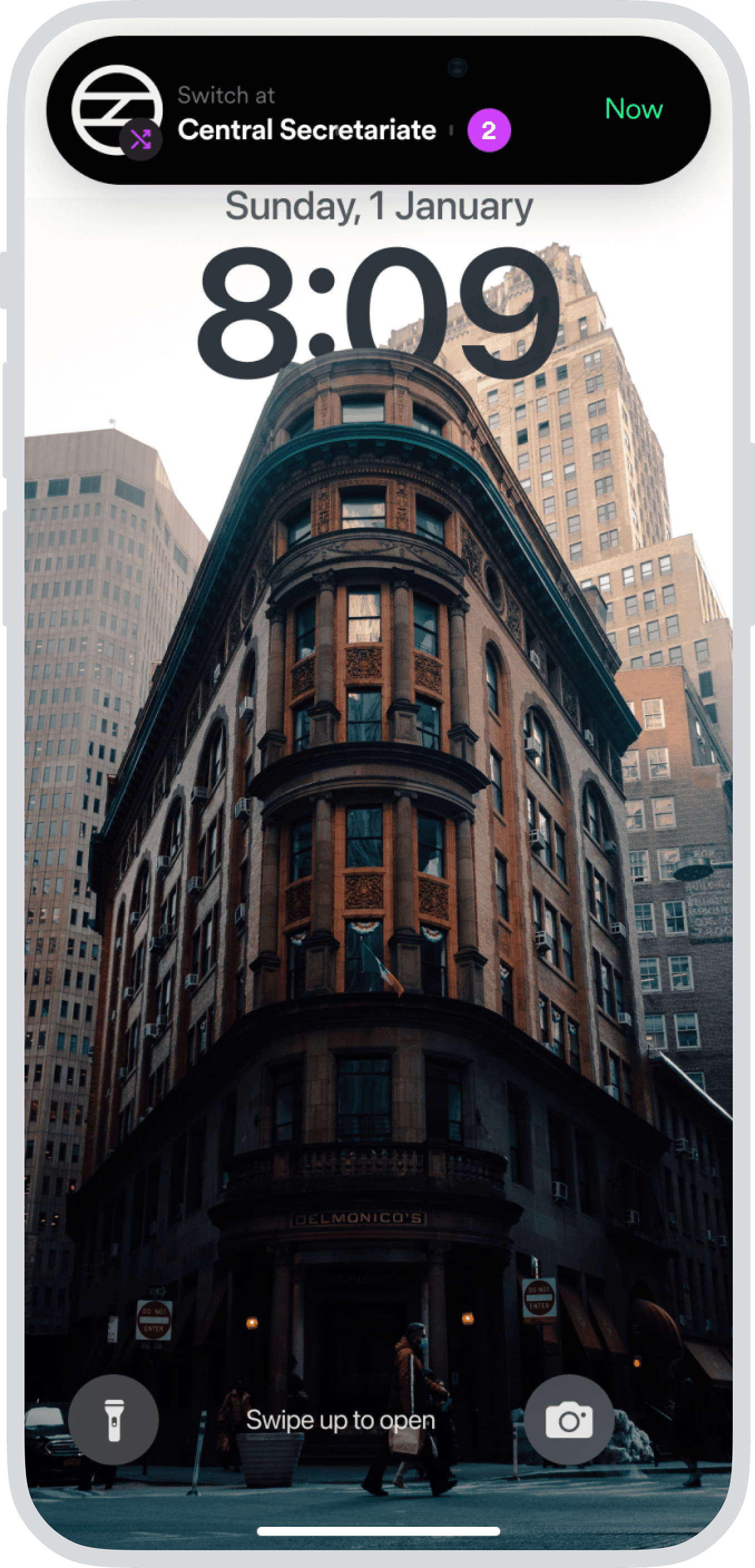
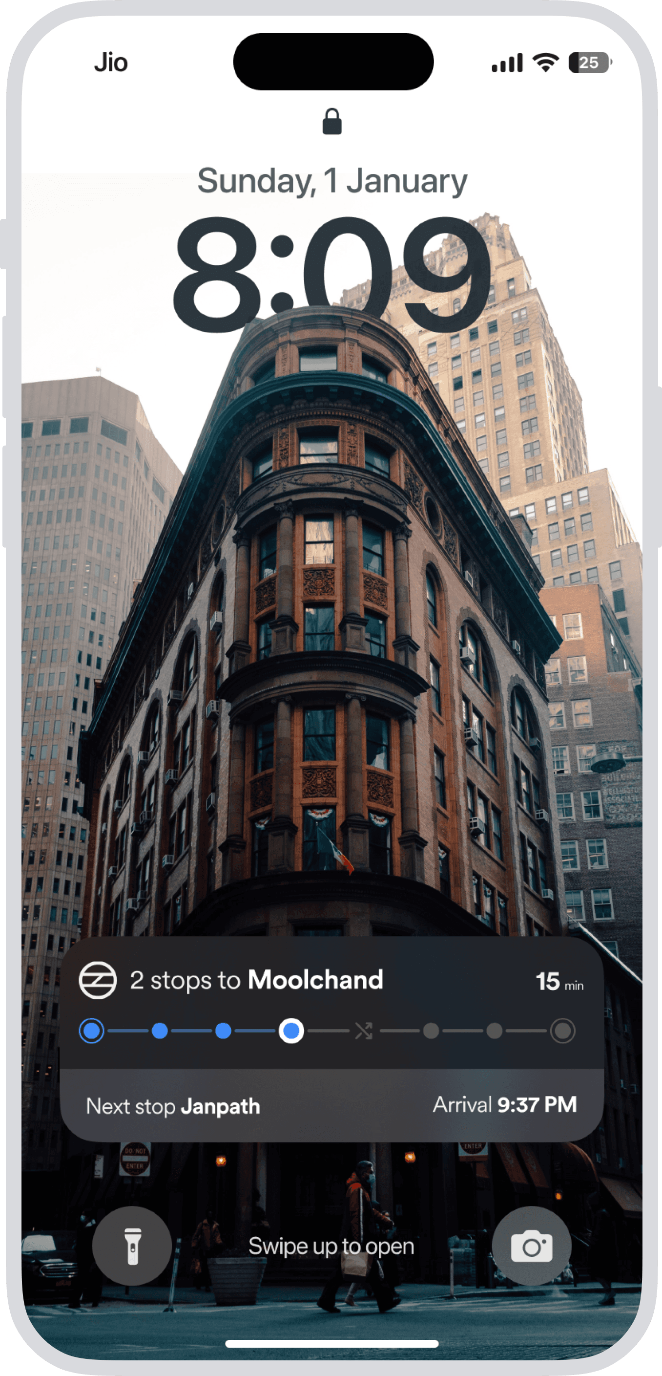
Step by step live notification about your metro journey, interchanging stations, deboarding stations with time to take action.
Crowd Monitor
Per-car occupancy updated every 60 seconds. Recommends the least crowded boarding point so users stop guessing and start boarding with confidence.
The end
hello
hola
salut
prego
namaste
ni hao
olá
ciao
s̄wạs̄dī
hallo

Yashvardhan Bhardwaj
Senior User Experience Designer
Designed with ❤️, Logic, and AI.
Copyright ©2026. All rights reserved.
Designed with ❤️, Logic, and AI.
Copyright ©2026. All rights reserved.
Yashvardhan Bhardwaj
Senior User Experience Designer
hello
hola
salut
prego
namaste
ni hao
olá
ciao
s̄wạs̄dī
hallo

These case studies goes deep and are built for bigger screens.
For the complete walkthrough, detailed interactions, and full visuals, view them on desktop.